Diosa
A clothing rental app that provides pregnant women with access to ethical maternity wear.
Role: Product Designer / UX Researcher
Timeline: 8 Weeks
Tools: Figma, Invision, The Landing
Background
When my best friend was pregnant one of her biggest issues was dressing her body. I remember the countless hours spent looking for a work-appropriate pantsuit and how time-consuming and expensive it was. There were honestly no easy solutions and the more stores we went to the more disappointed we became. The options were extremely limited and any garment she invested in would be worn briefly. I vividly remember her saying to me “I wish there was a way I could wear these clothes and send them back”. The seed was planted that day and sprouted almost a year and a half later in this case study.
Discover
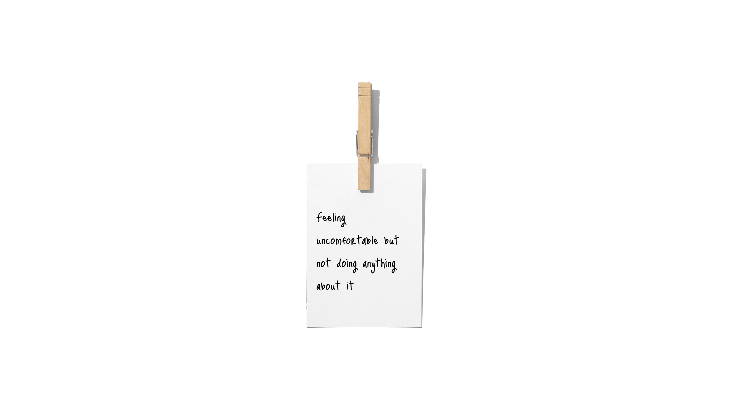
Pregnant women of all ages have trouble dressing their “unfamiliar” pregnant bodies. it’s hard to rationalize a financial investment for a temporary body change.
I hypothesized that if I can help pregnant women rent maternity clothes throughout their pregnancy while catering to their specific budgets and needs then they will find the process of transitioning their wardrobe less stressful and more fulfilling.
Through my secondary research I discovered that:
Maternity wear has a waste problem
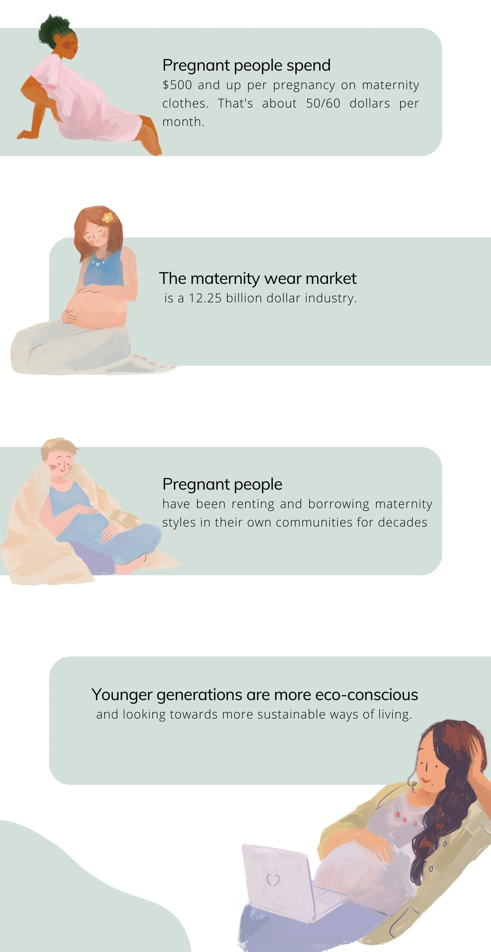
The change in consumer behavior and demand for eco-conscious products has led to the ever-growing clothing rental market.
All of this research led me to narrow down my HMW question:
HMW provide pregnant women with access to ethical maternity wear so that they may express their fashion sense while adhering to their personalized budget?
I conducted primary research in order to investigate the challenges that pregnant women faced while dressing themselves. I created an interview script and made sure to interview subjects that had experience shopping for maternity wear in the US.
My goals were simple.
I wanted
to be able to place the acquired data into specific categories such as pain points, motivations, behaviors, and themes.
a deeper understanding of the user's needs and wants.
to uncover a potential solution to the problem at hand
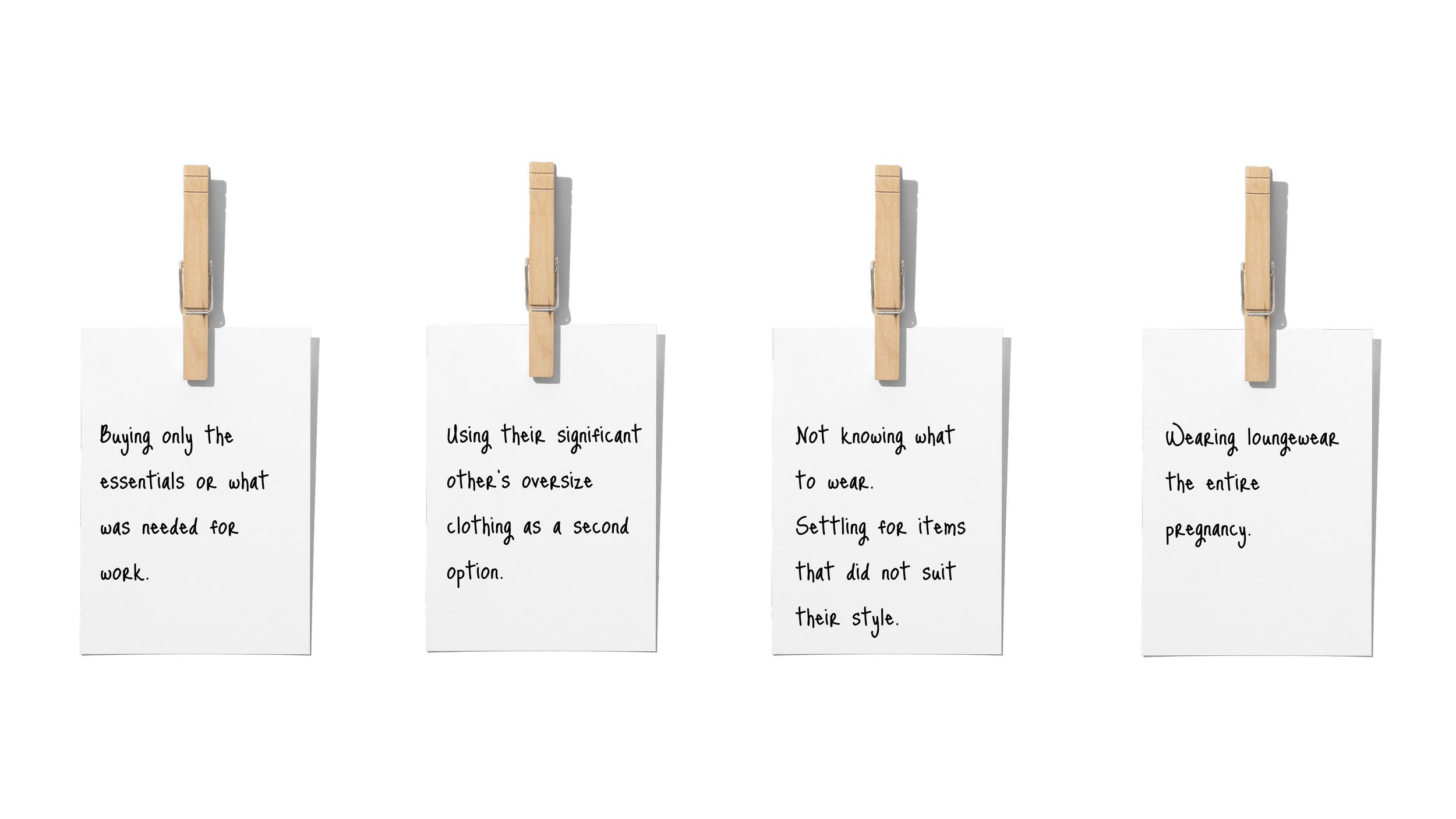
Three candidates were selected to interview through a means of qualitative and quantitative research methods with open-ended interview questions. From the interviews, I gathered that each subject had particular
Motivations
Pain Points
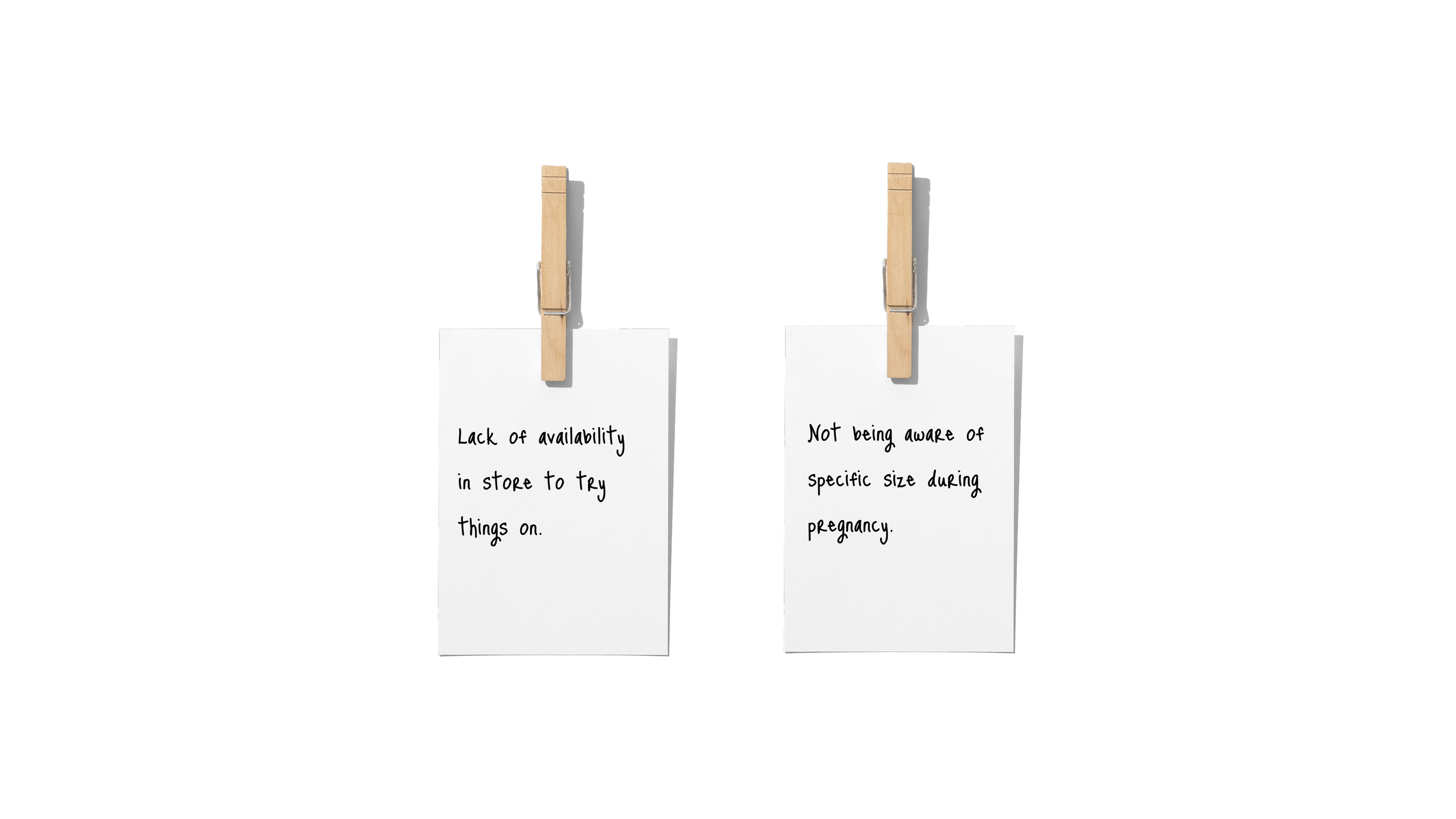
Behaviors
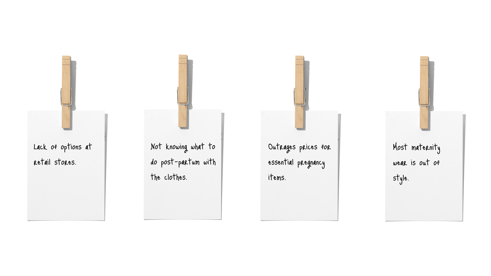
However, there were four specific themes that kept coming up.
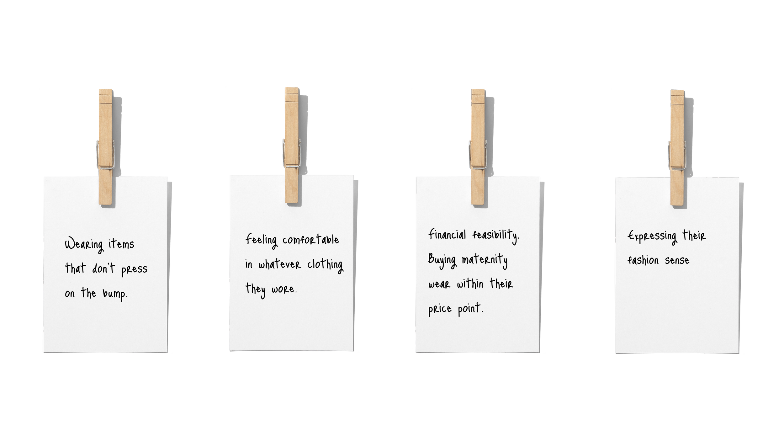
Desire to find maternity clothes that fit and resemble their style
Lack of maternity wear within their price range
Prefer to get rid of clothing post-partum
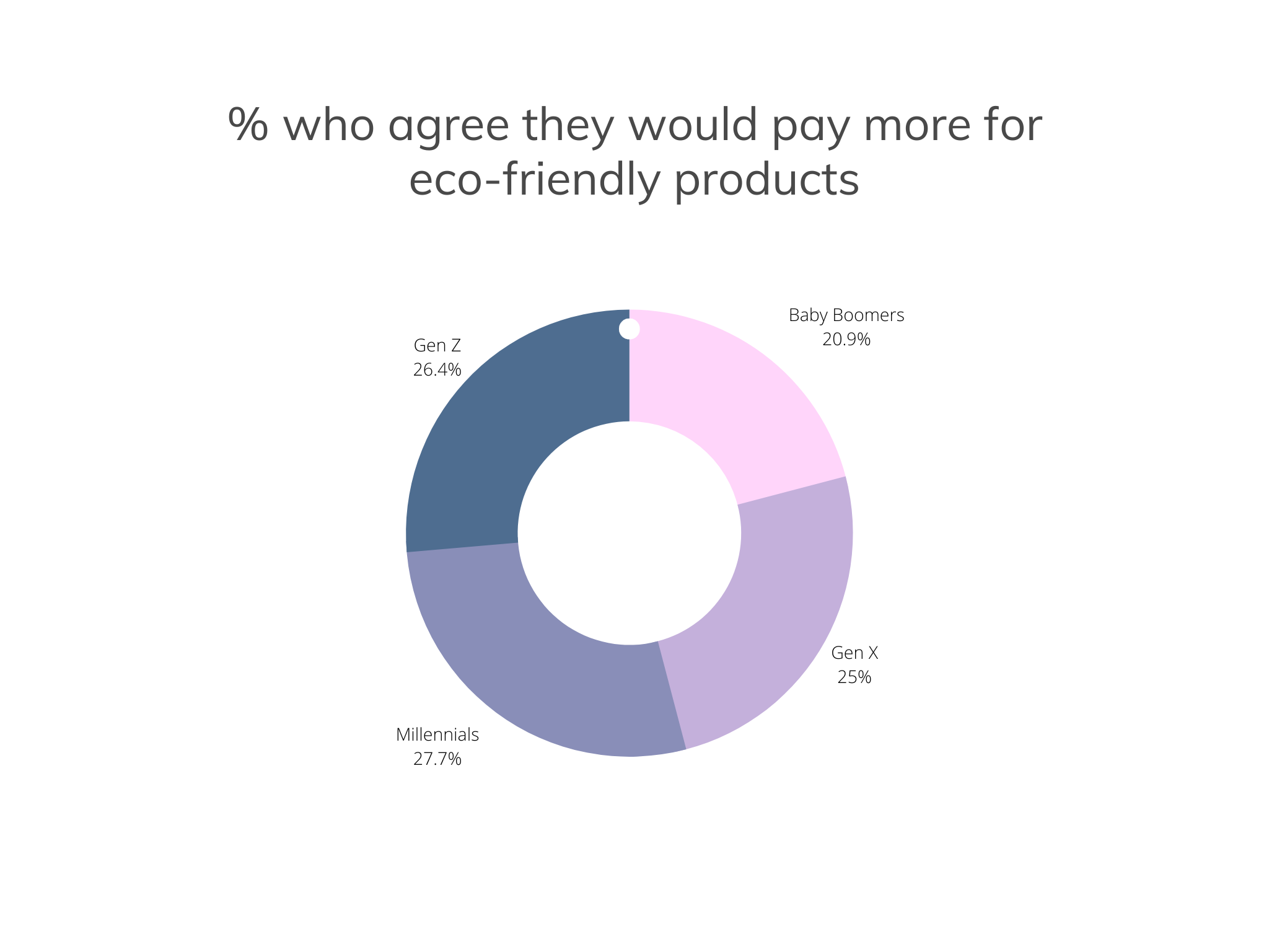
Keen on making eco-conscious choices
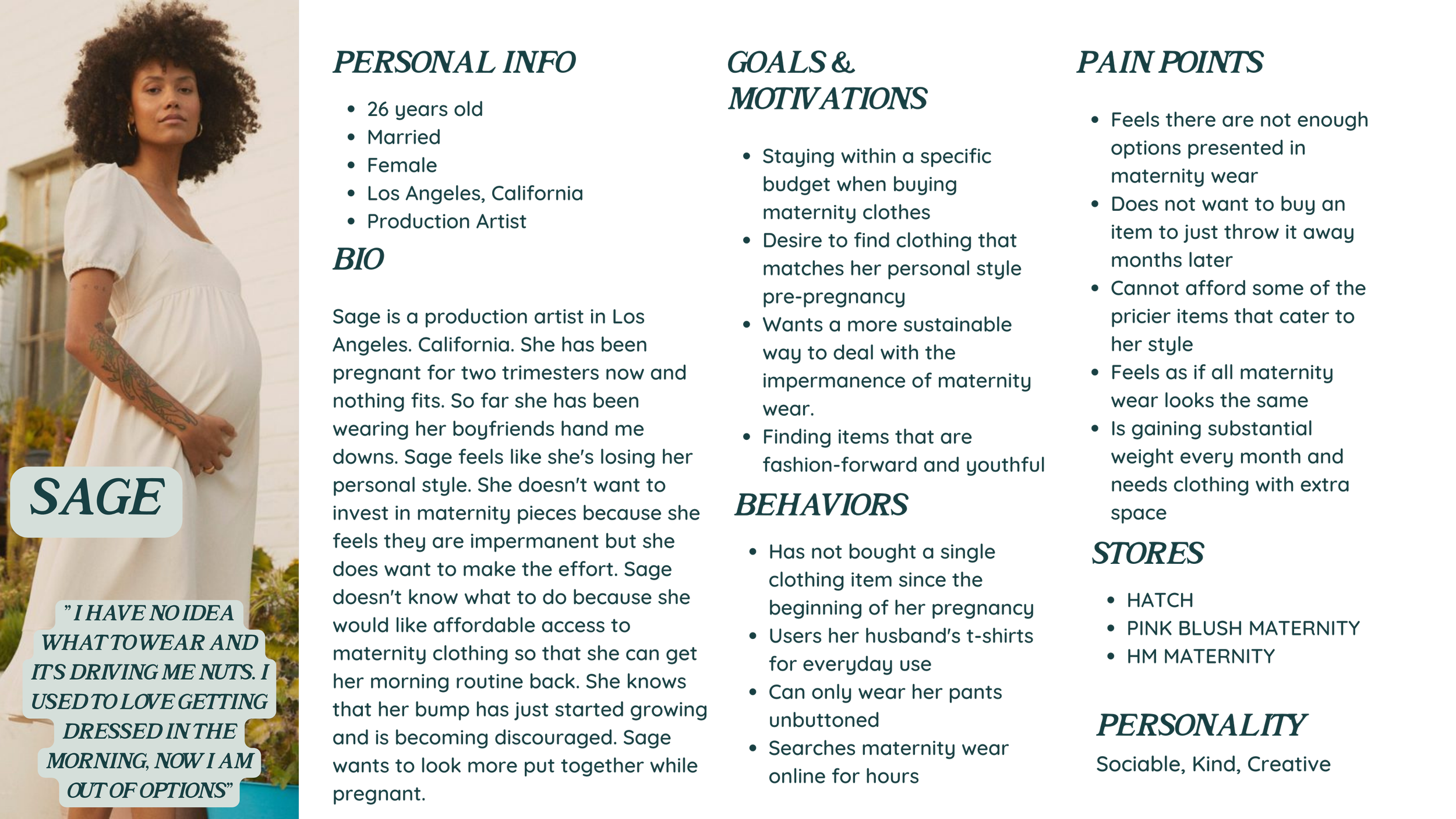
I ended up with insight that allowed me to identify specific themes within my problem space. In return, I constructed a user persona and was able to create an experience map based on my user persona’s journey.
Analyze
After conducting all of my research, I began to understand my user's point of view. The process of empathizing allowed me to look deeper into my user's situation. I created a user persona along with experience maps, and epics. The user persona is a fictional character based on primary and secondary research. This character is based on our ideal customer. In this user persona, we are introduced to Sage, a 26-year-old recently pregnant production artist. She is having issues finding sustainable ways to dress while pregnant and she still has not found a platform that presents her with the options she would like.
The user experience map is a way of visualizing the experience that a customer goes through while using a product or service. In this case, sage is six months pregnant and cannot find a dress to wear to an event she was invited to. This experience map shows her journey from realizing nothing fits to receiving a maternity dress she bought online.
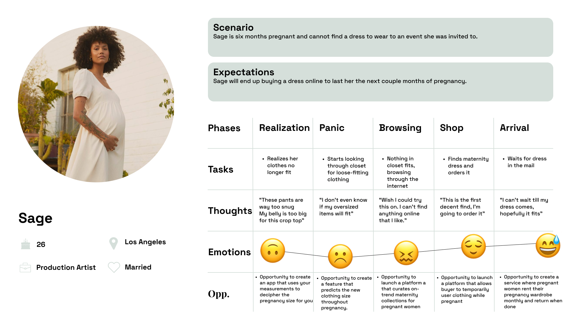
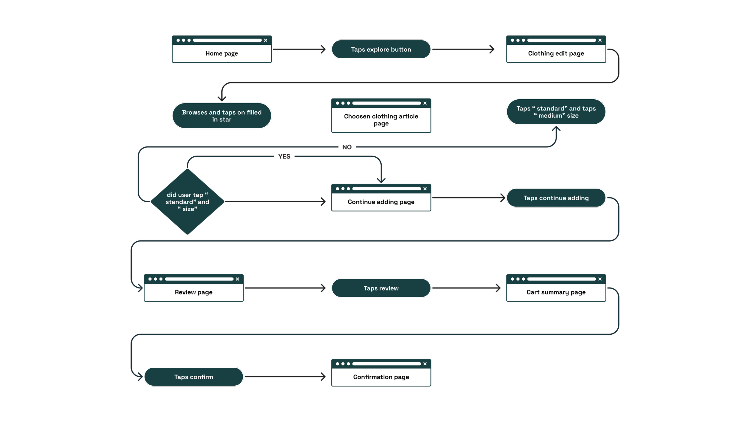
After narrowing down all my user stories I created a task flow based on Sage's core epic: Platform Navigation.
Prototype
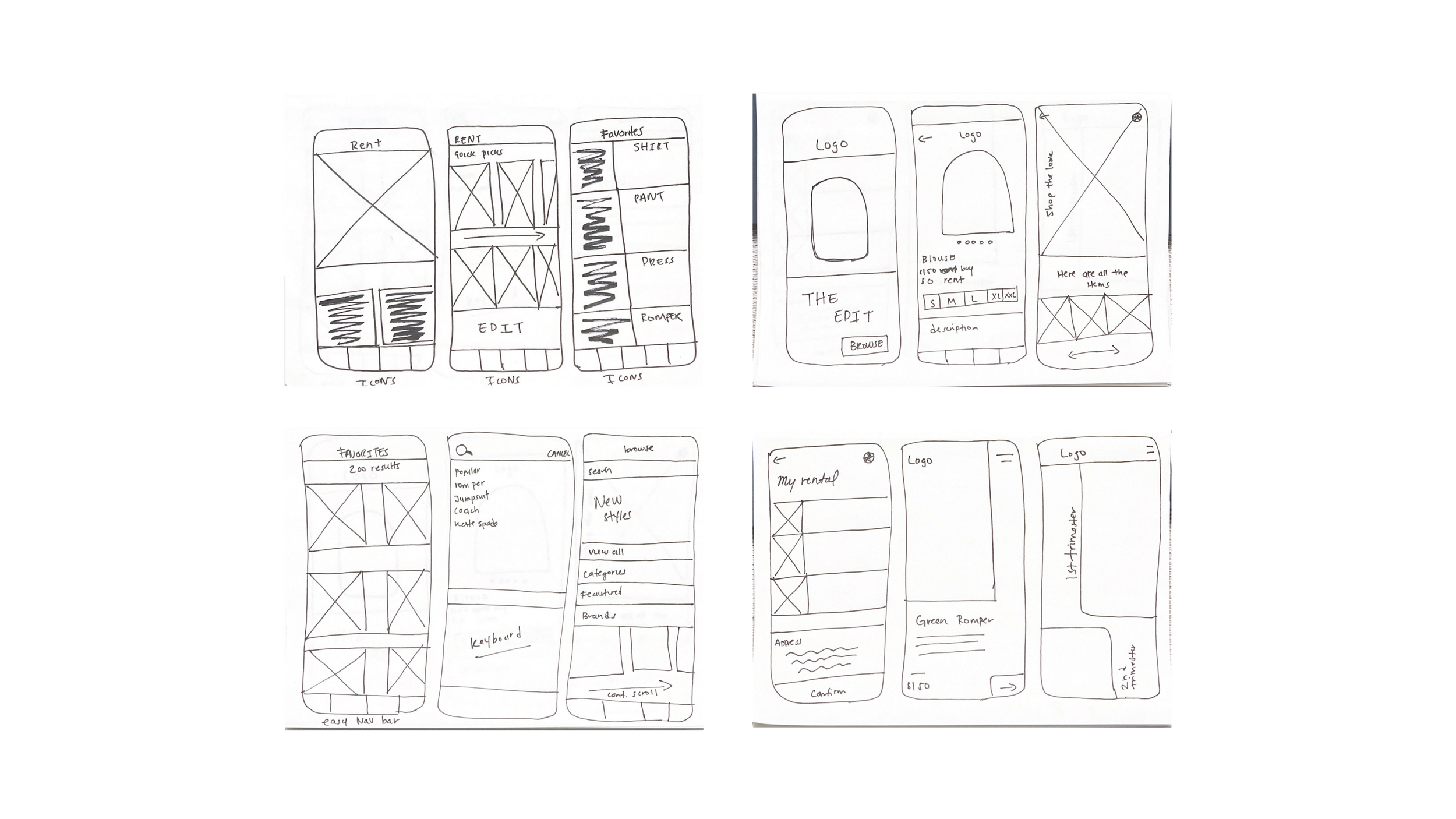
This was by far my favorite ( but also stressful ) part of this process. Prior to sketching, I created a UI board full of mobile apps/ functions that inspired me.
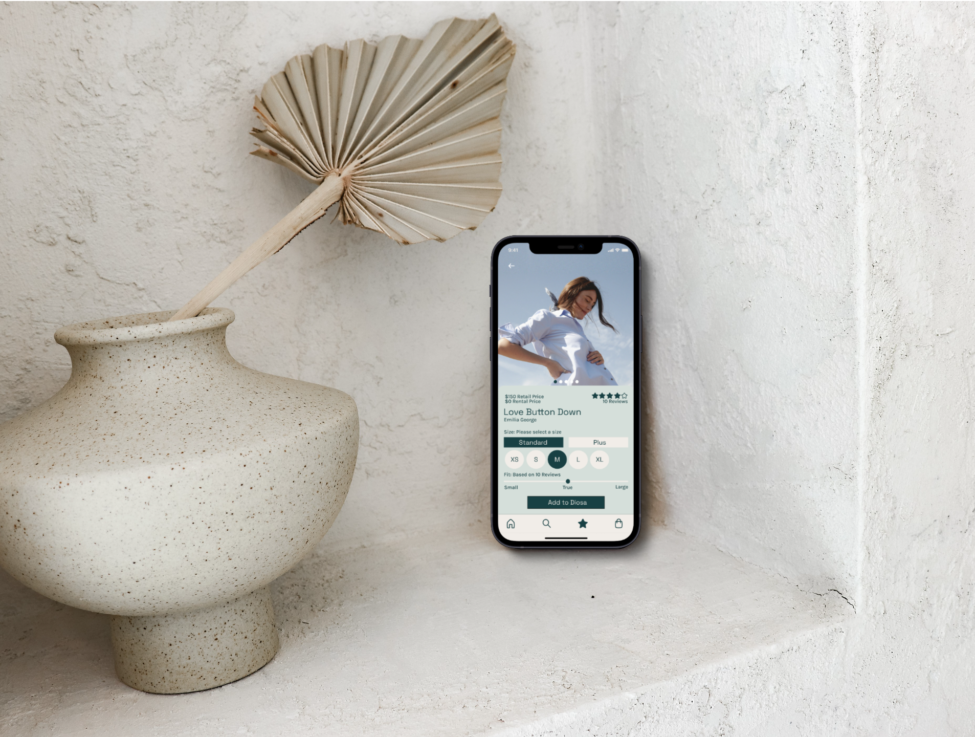
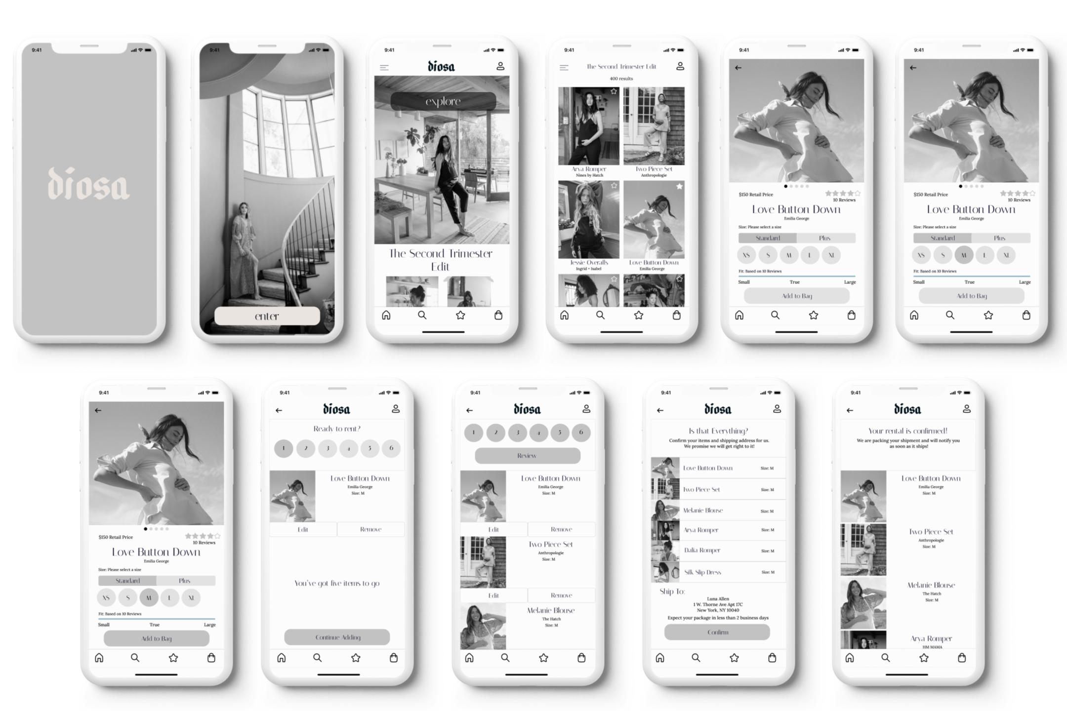
The UI Inspo from my Invision Board helped me create the exploratory sketches for my app. I began by taking concepts that I enjoyed and putting them together with my idea. This was one of the first times where I was very confused as to where I wanted to place specific things. The first page of this slideshow shows my exploratory sketches while the remaining two show my solution sketches. In these solution sketches, I created the format for the first three pages mentioned in my task flow. I wanted the entry and home pages to be very minimal and advanced. A confusing interface will only turn users away from the app.
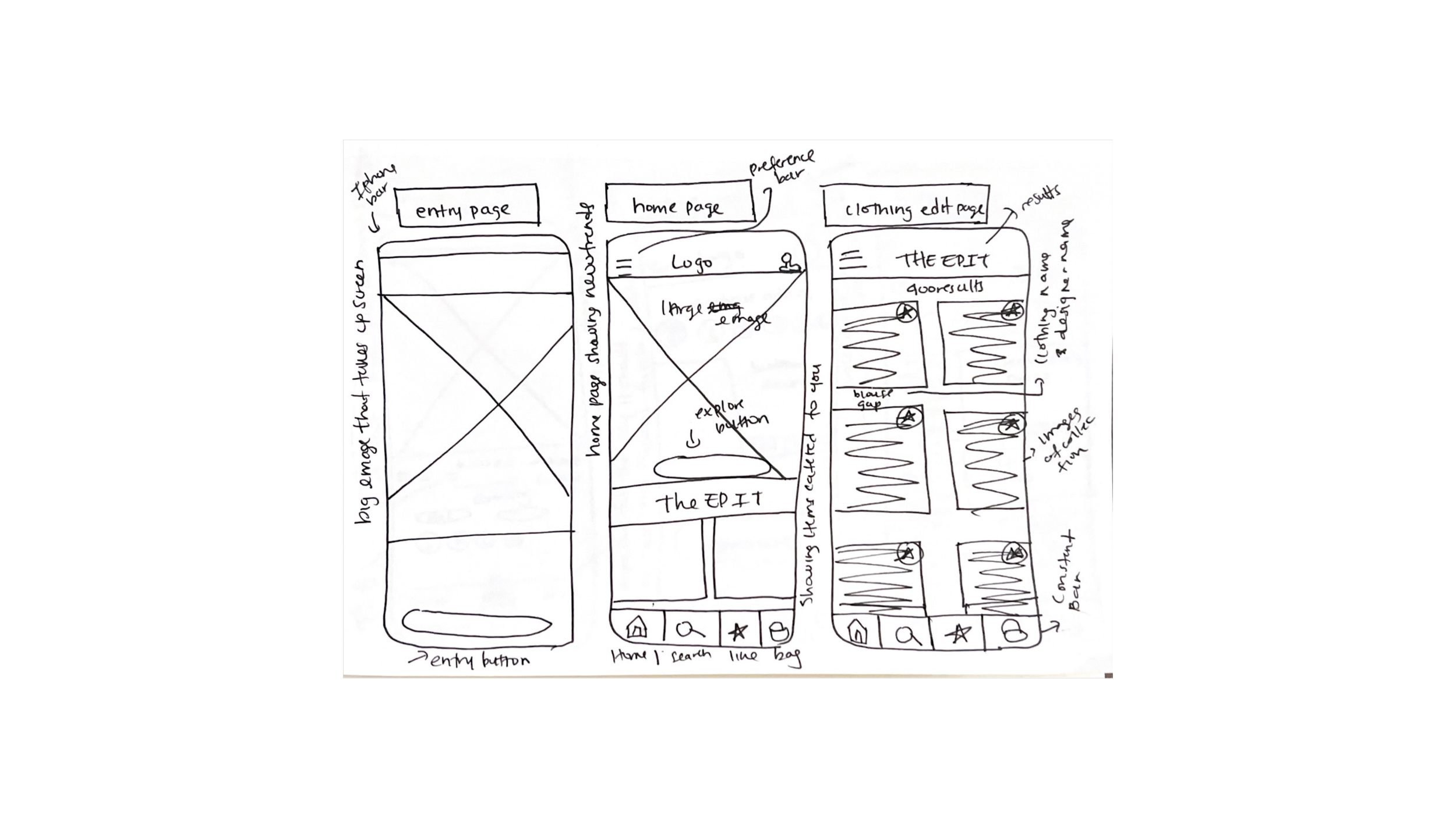
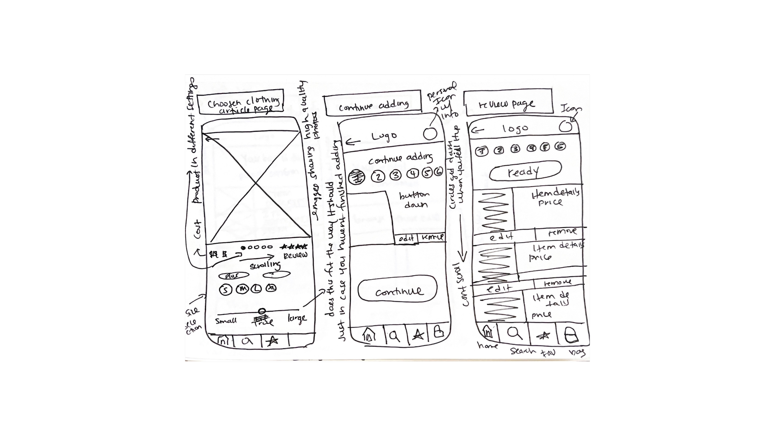
I then turned my sketches into wireframes
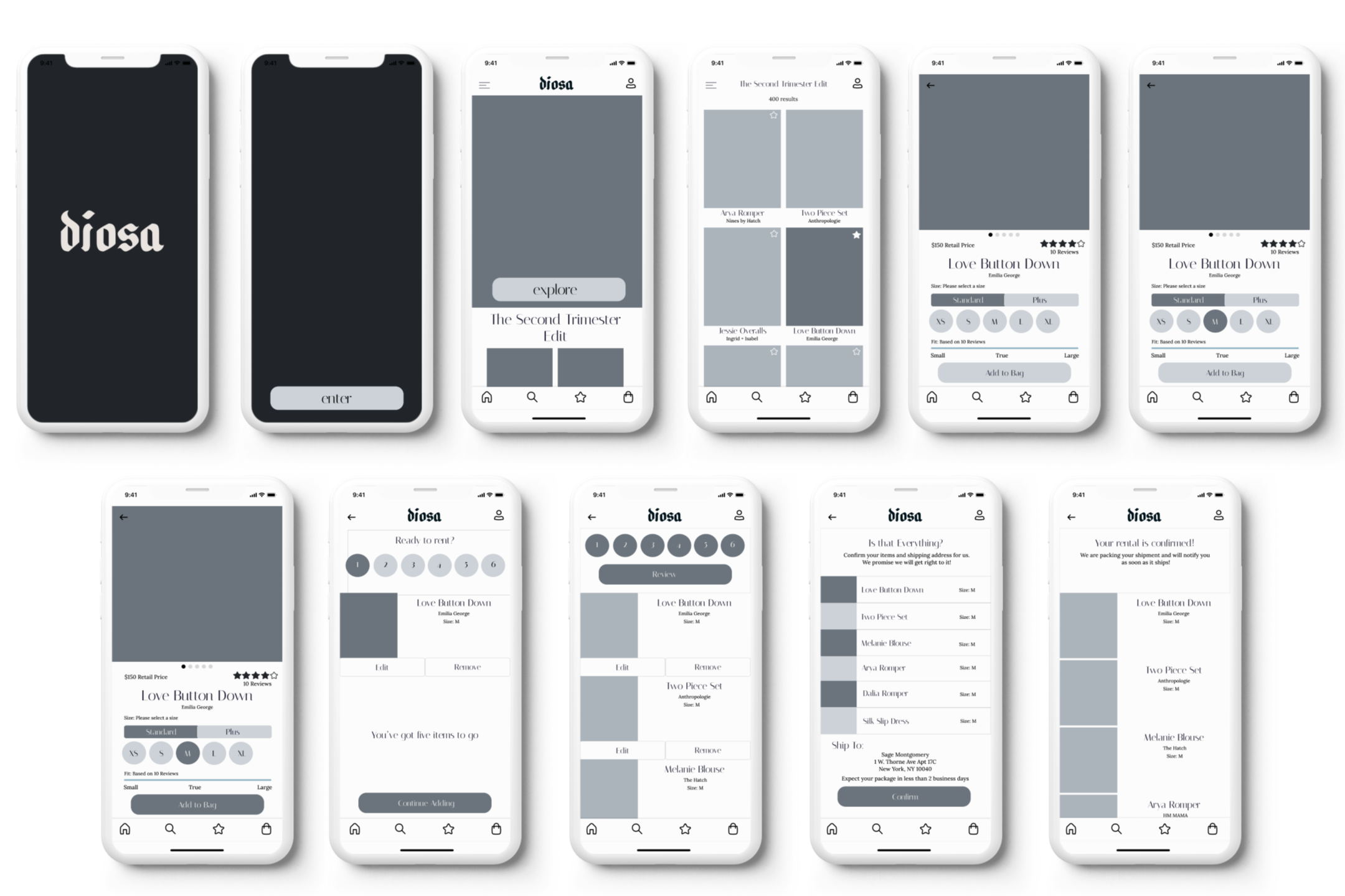
I completed three rounds of user testing and received feedback that helped me create my hi-fi wireframes. Most of the problems in the initial user testing came from the call-to-action buttons. There were also some alignment issues and the icons on the bottom weren't highlighted therefore the user did not know what page they were on. The second and third rounds allowed me to refine aspects of the navigation that some users did not fully understand.
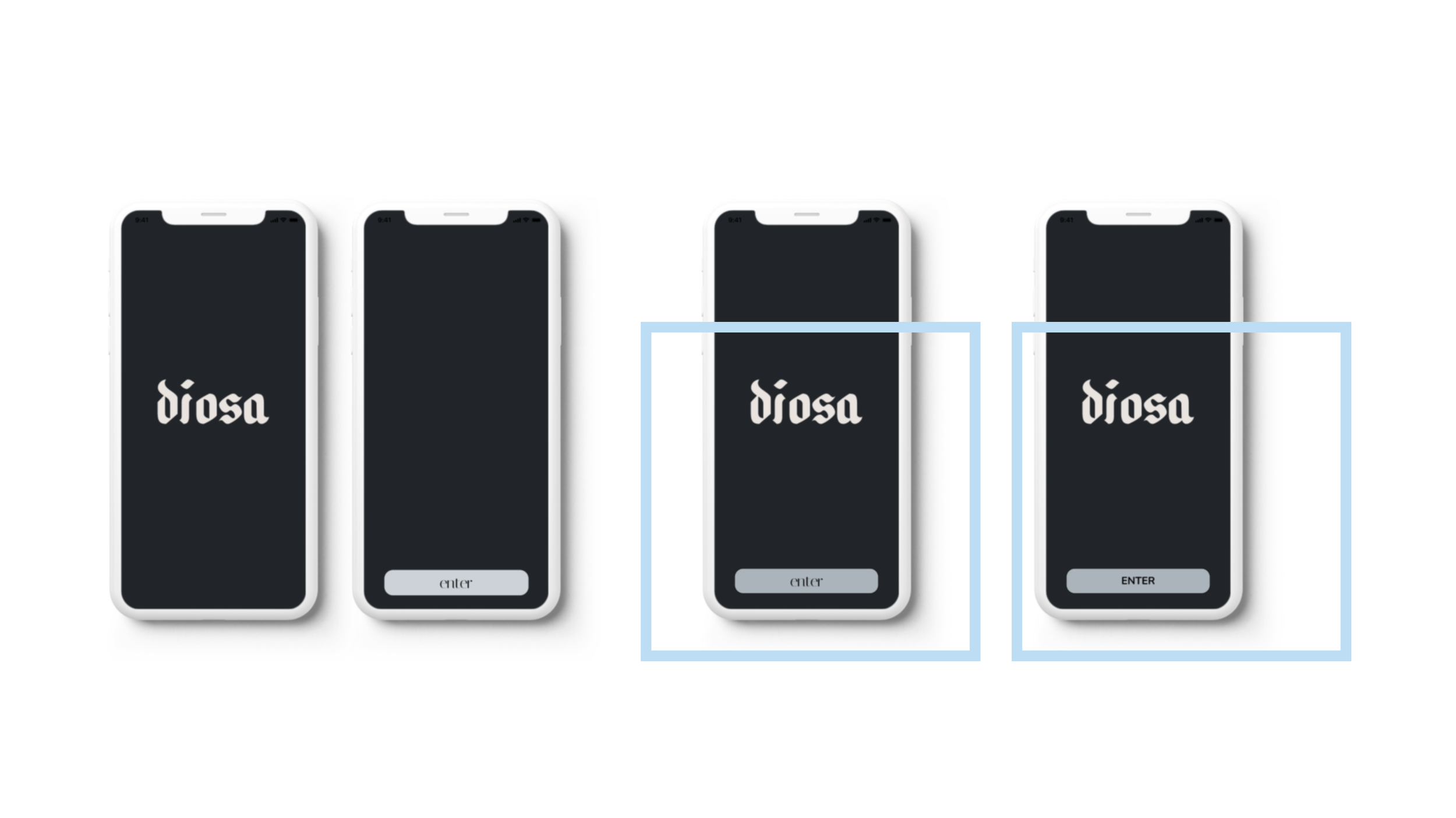
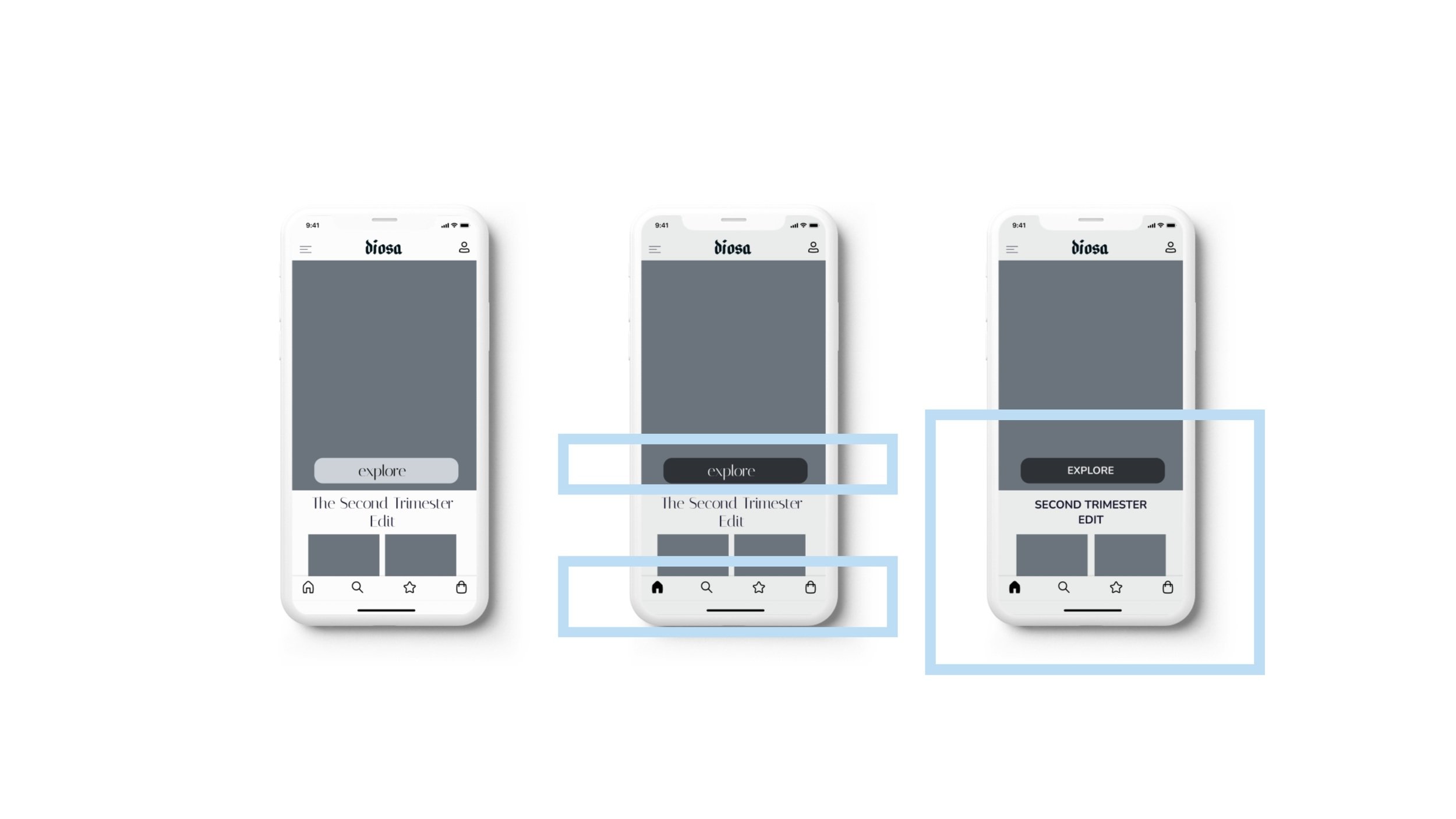
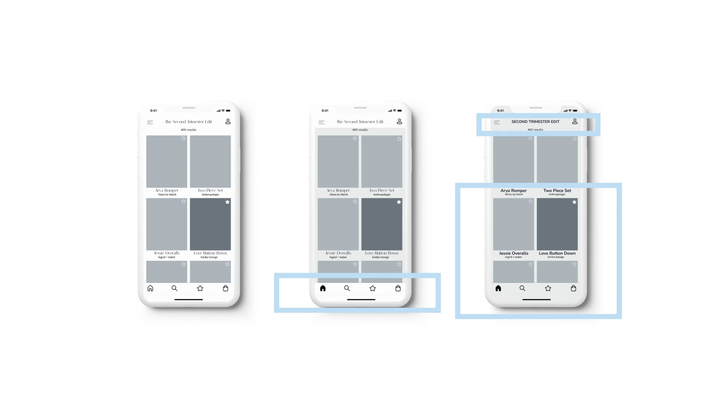
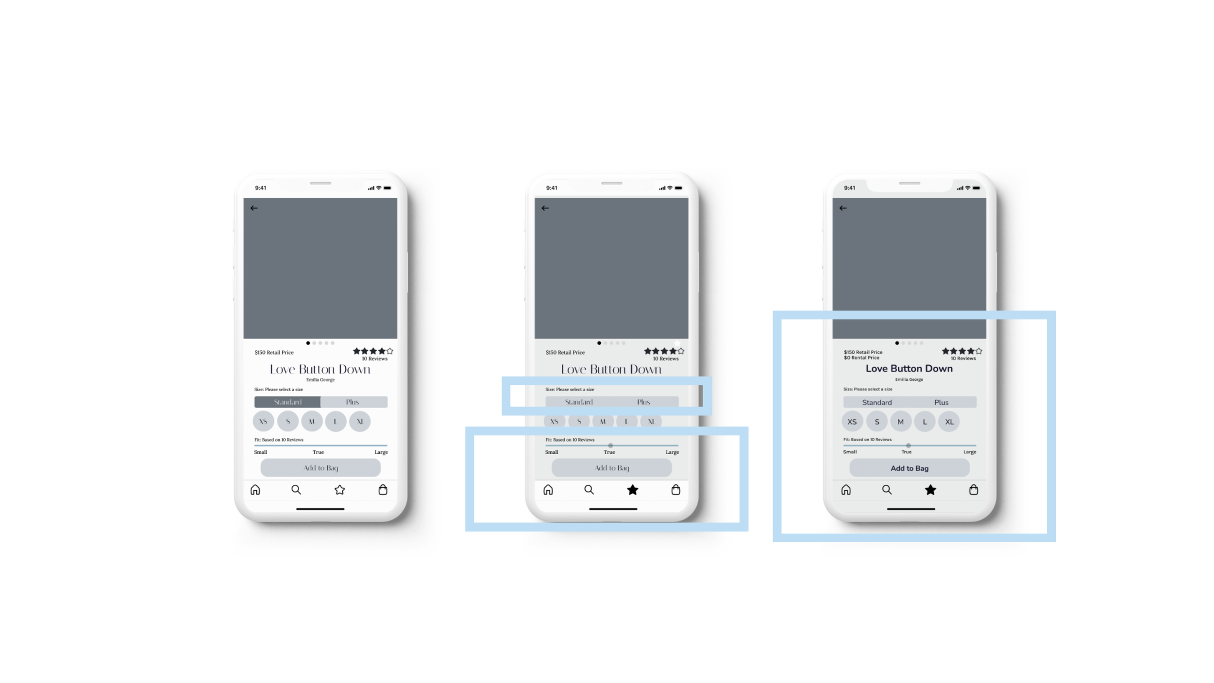
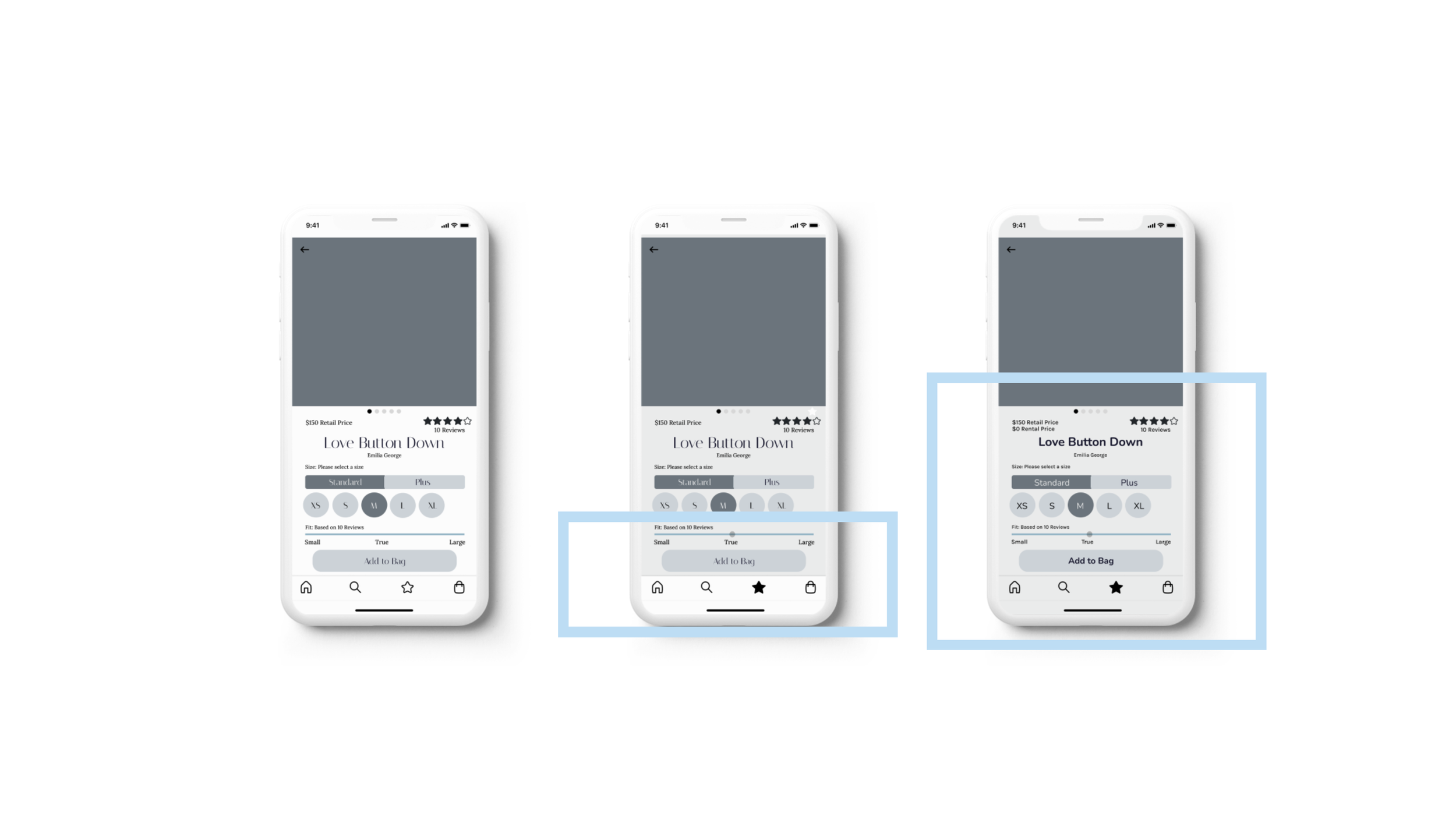
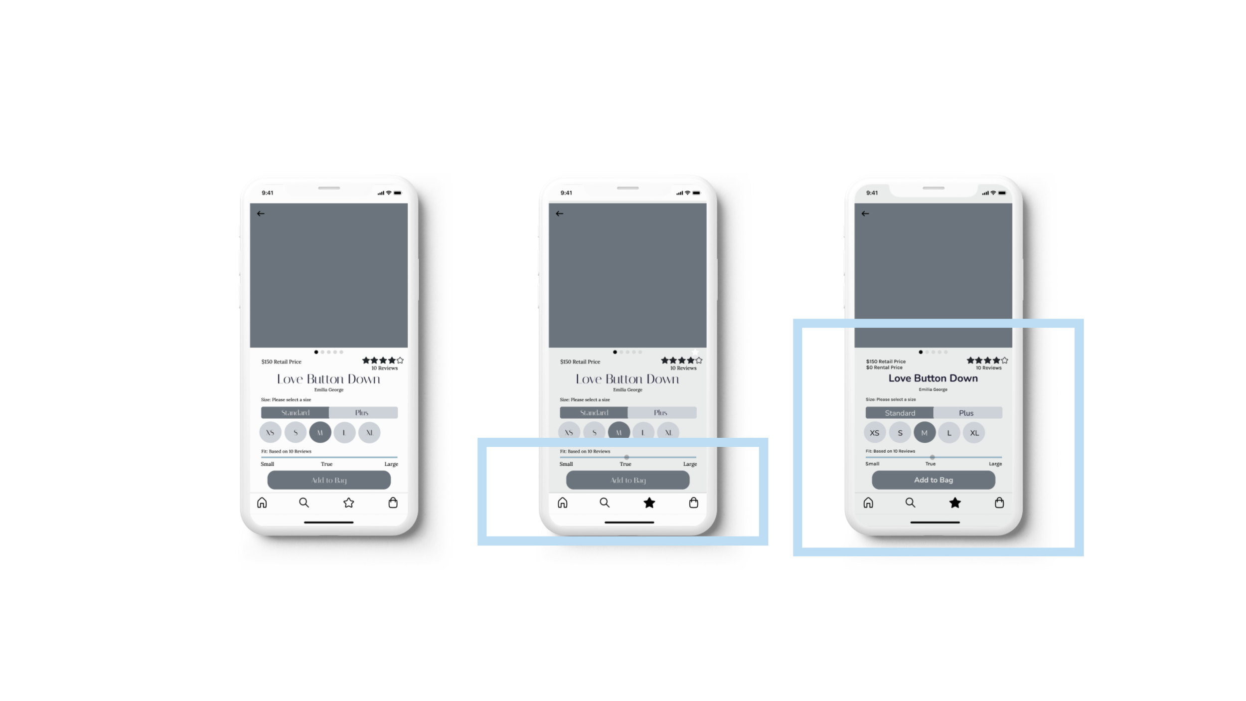
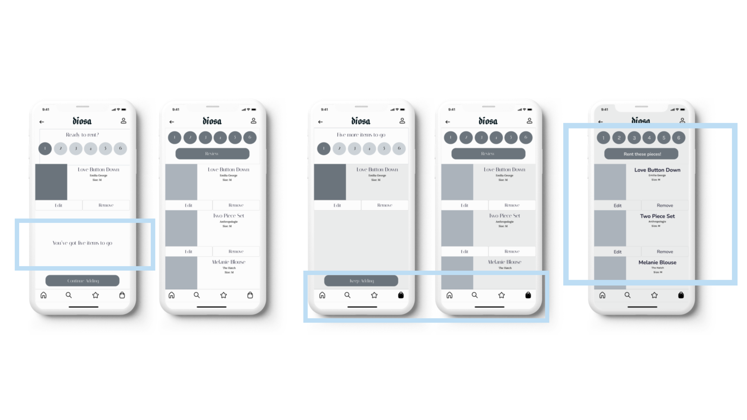
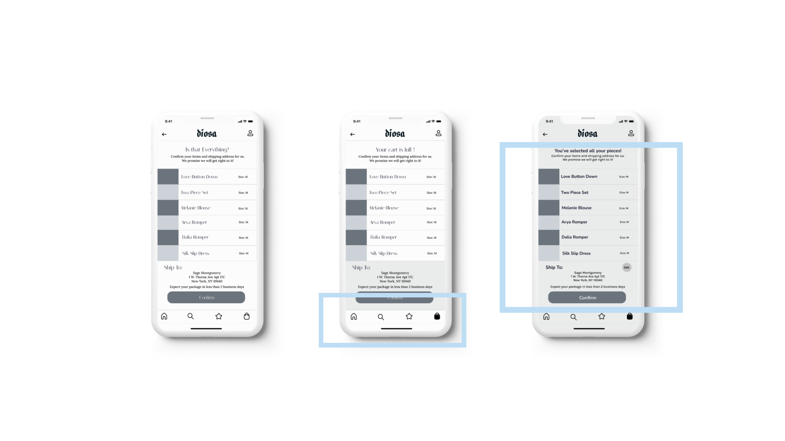
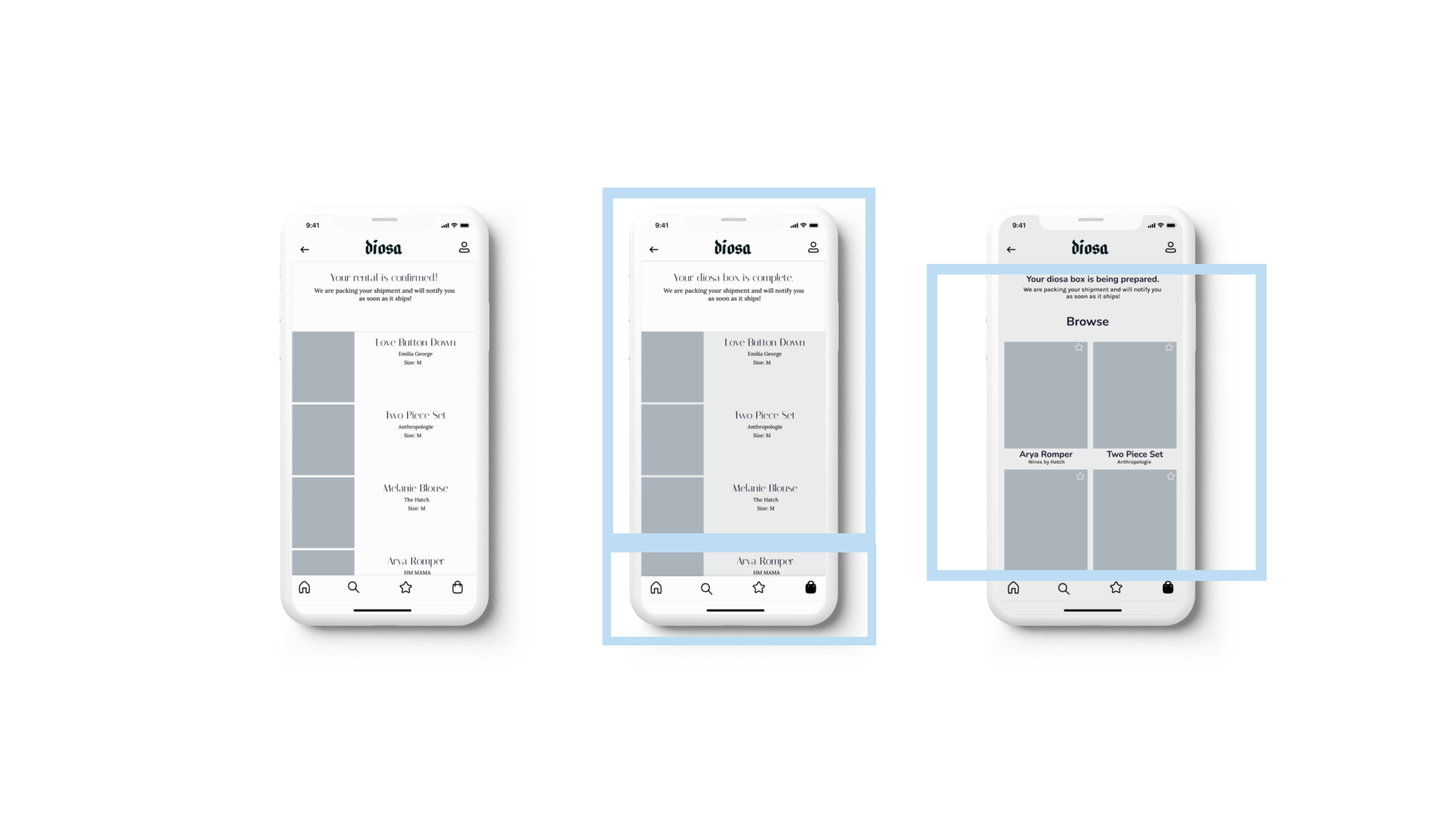
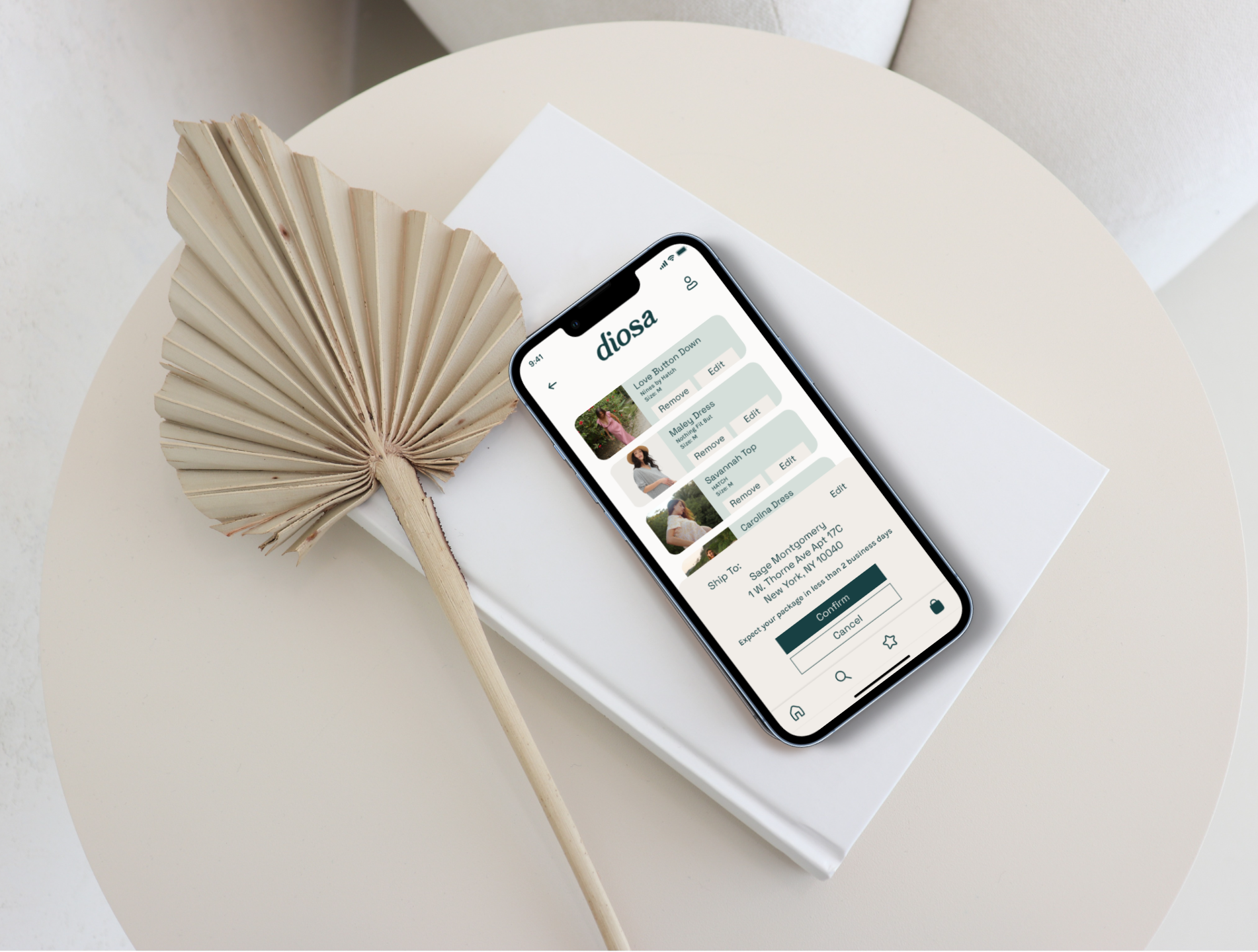
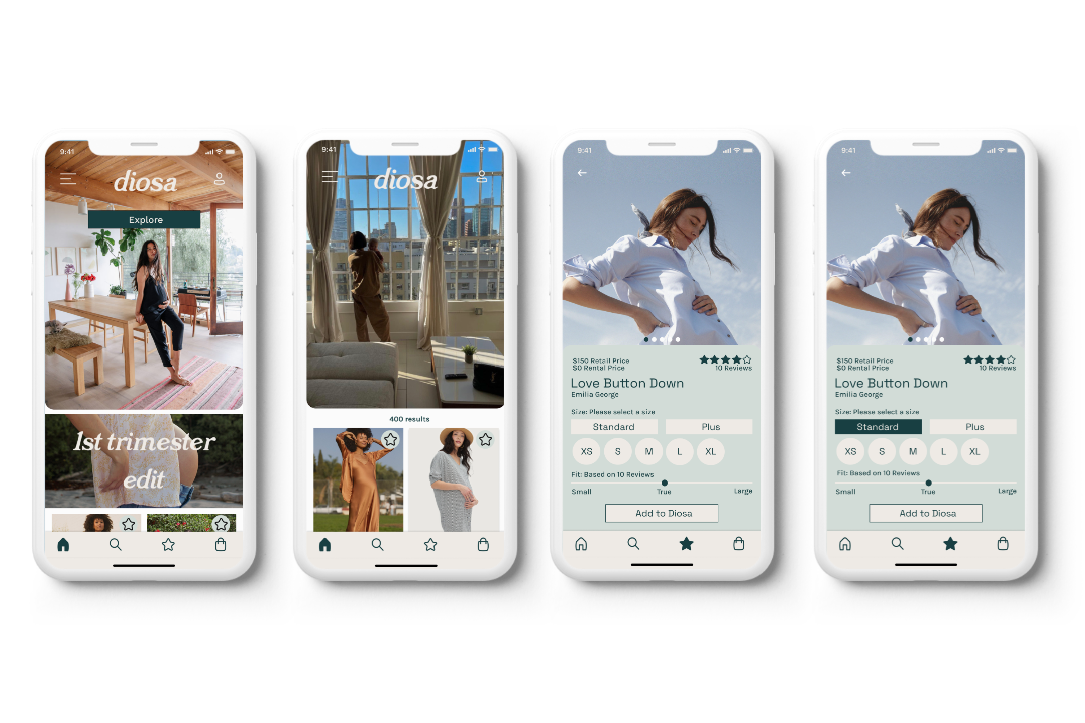
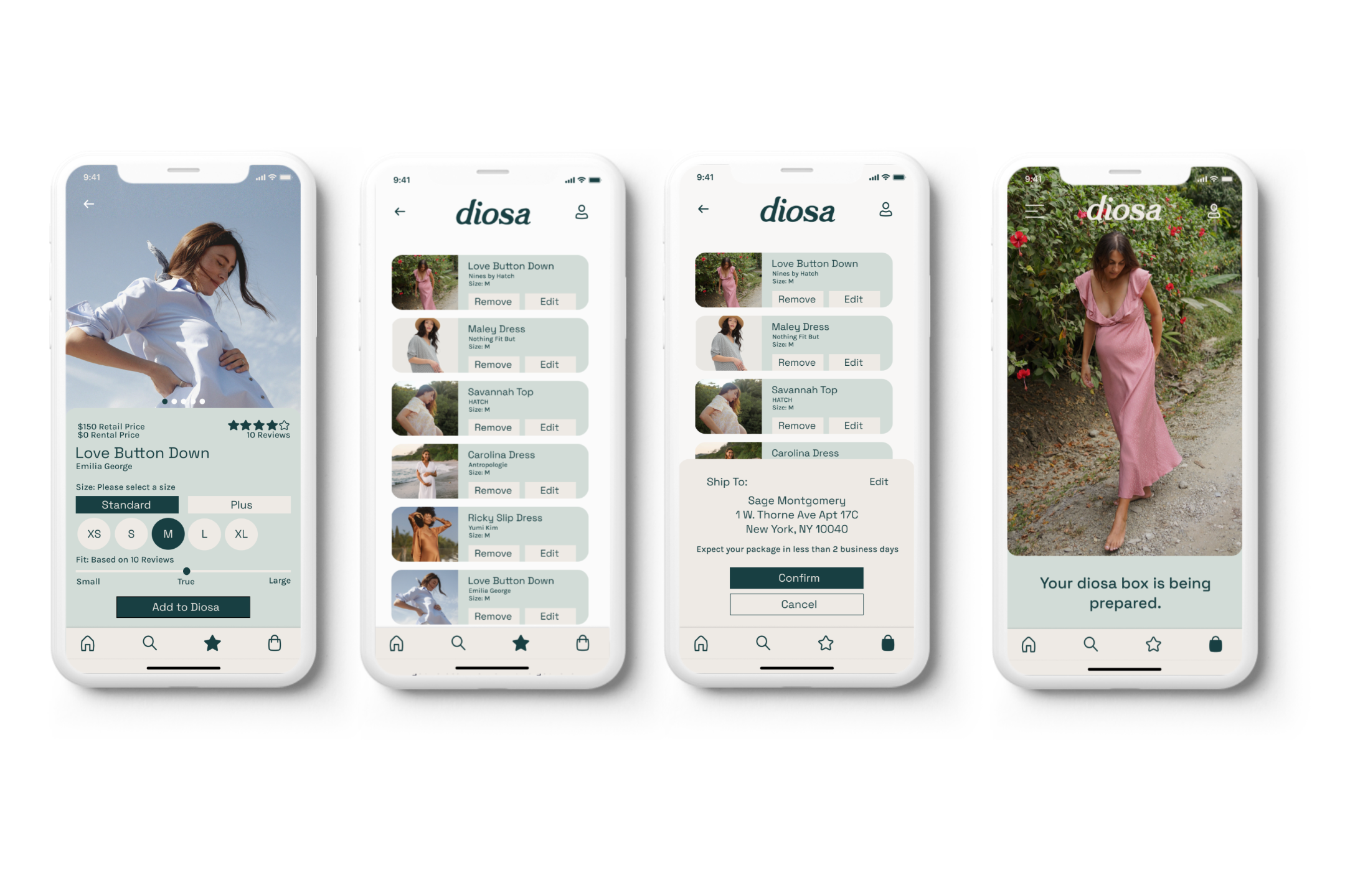
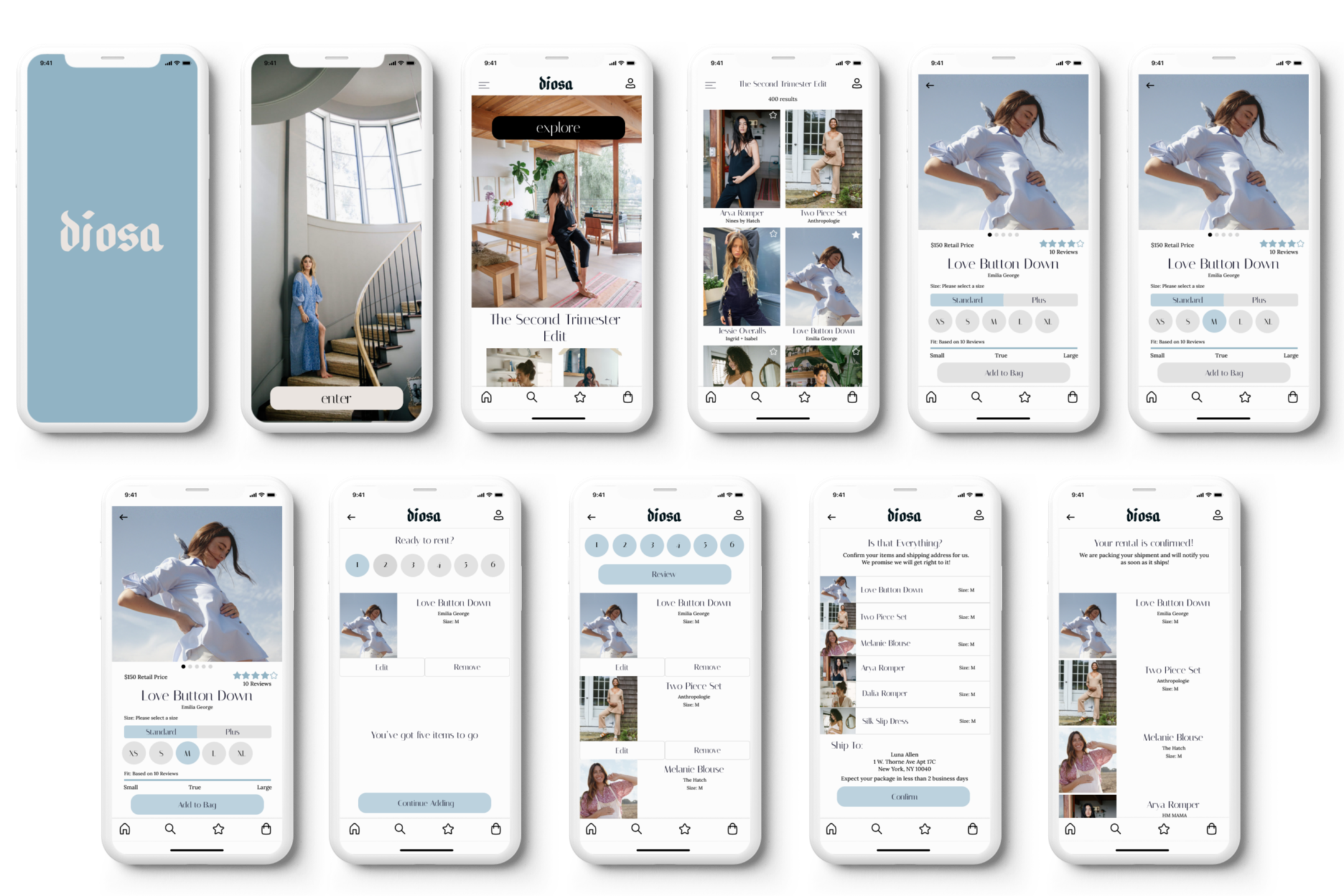
The above carousel showcases all three versions of my prototypes. I surrounded the areas that changed after each user testing session in light blue. version one ( my initial prototype) is on the far left, version two in the middle, and version three on the far right.
I created two design matrices, one after each user testing session. I made sure to make changes that required low effort but had high user value.
The following are versions that I created of my wireframes. I went as far as implementing color to the second version. After my second user testing session, I changed the flow of the app and therefore had to write off these two versions off as experimentation.
Design & Deliver
Developing my brand was harder than I imagined. From the beginning of my thought process, I wanted to give my app a name of ethereal nature. When I was studying Art History in college we learned about ancient temples that were created to worship pregnant people. Most early civilizations believed that they had a closer bond to god consciousness due to their ability to conceive. In their own way, these people were gods/goddesses. In Spanish, the word god/goddess translates to “Dio”/" Diosa" in Italian “Dio”/" Dea". I went back and forth between the two languages, and the masculine and feminine versions but ultimately chose the Spanish version "Diosa". Through this app and this name, I wanted to give power back to the conscious creators of the earth, the people who will ultimately be using my app. The Diosas.
Diosa is
more airy than stuffy
more retro than modern
more spring than winter
more refined than undeveloped
more bright than dull
more transcendent than ordinary
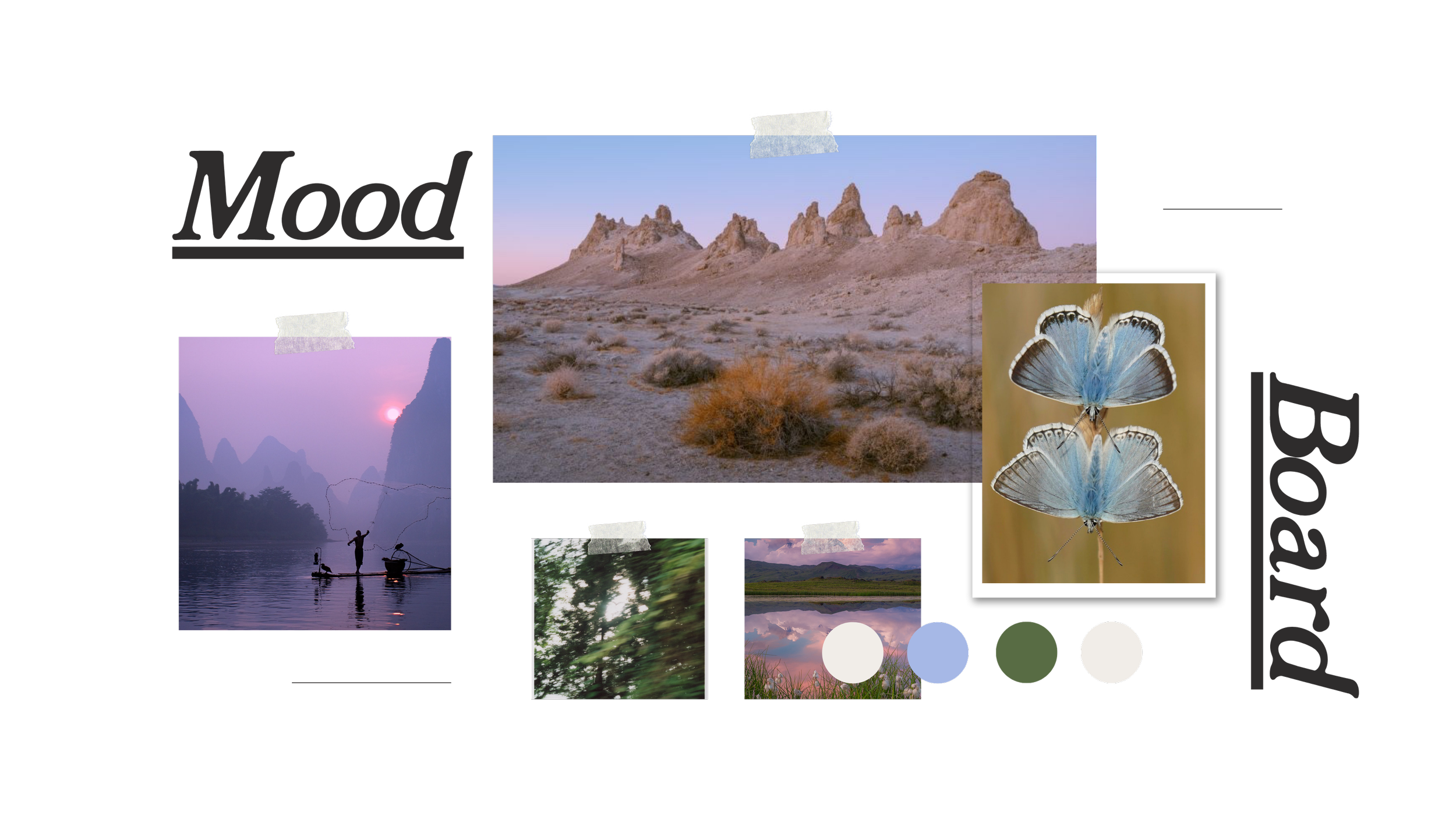
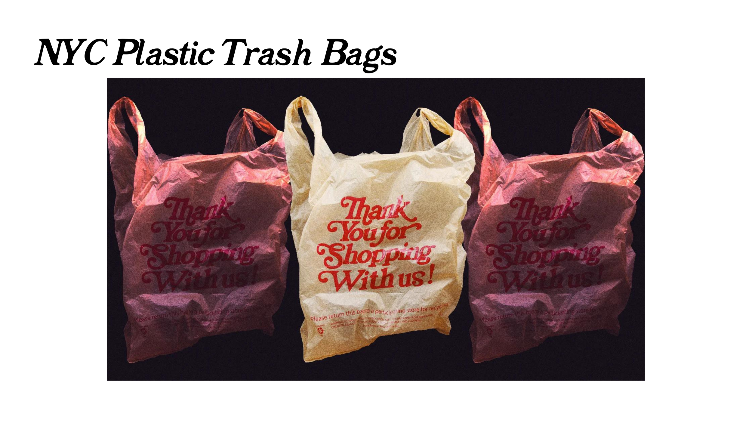
The moodboard I put together helped set the tone for the way I wanted my app to feel. This inspiration spiraled me into digging deep and figuring out my brand identity. One of my biggest inspirations was the NYC trash bag “ thank you for shopping with us” font face. I spent a few hours searching for one similar and stumbled upon“ El Hidrant”.
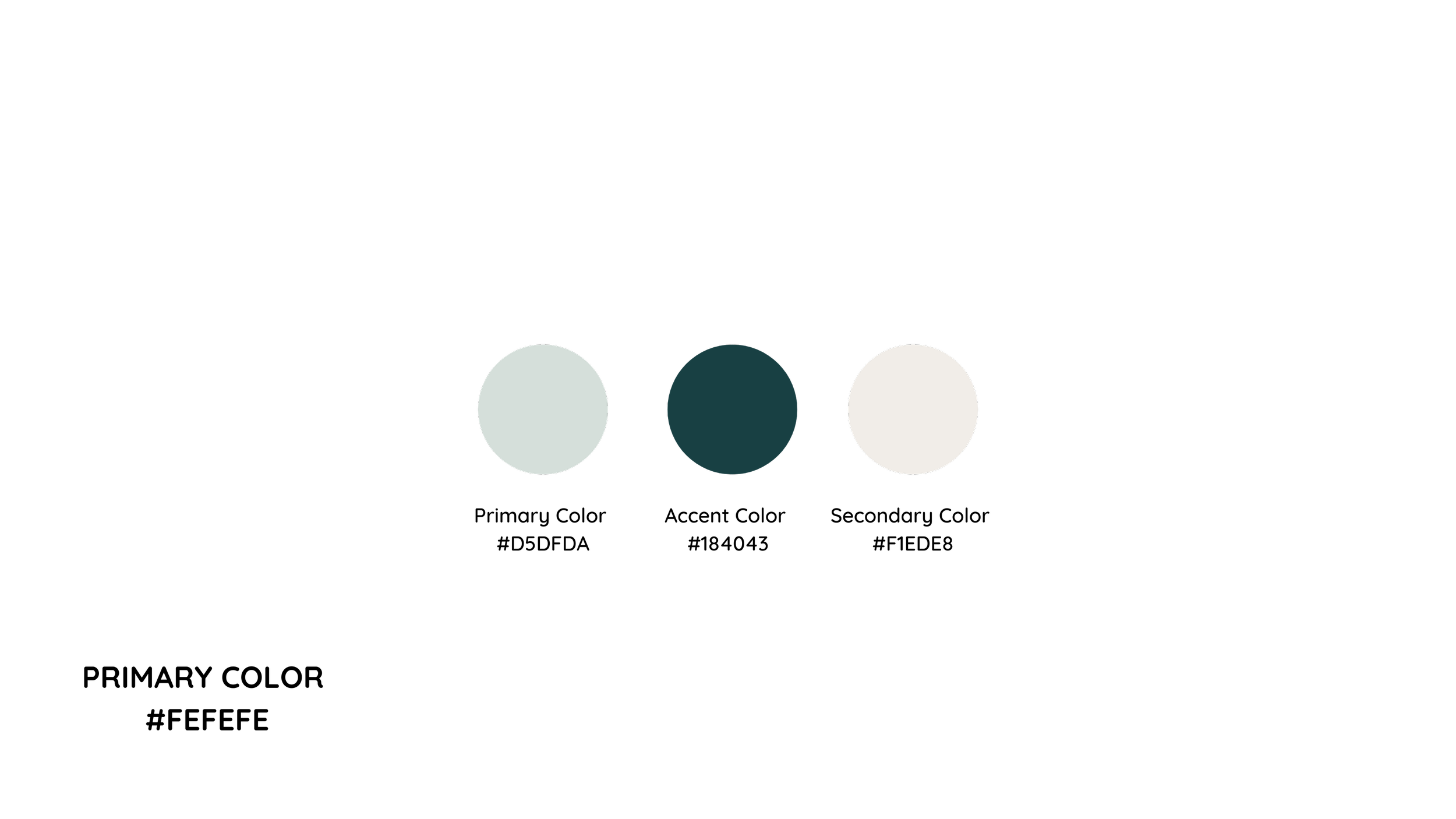
Color selection was the hardest part of this process. I experimented with so many colors and decided on the four below through trial and error. Accessible color combinations were really important to me. I decided to use an accessible palette builder to create for AA level or higher. I also used another platform which allowed me to raise those standards and enable all users to enjoy my content.
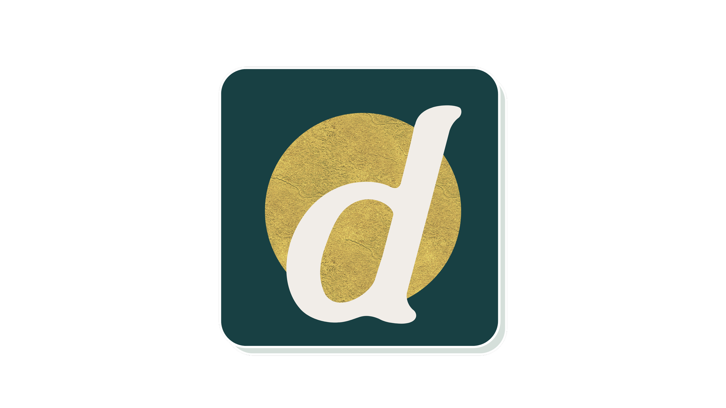
I experimented with many different typefaces when creating my wordmark as well as my app icon. I could not narrow it down for the life of me so I placed all my family members in a group chat, sent them each icon, and let them decide.
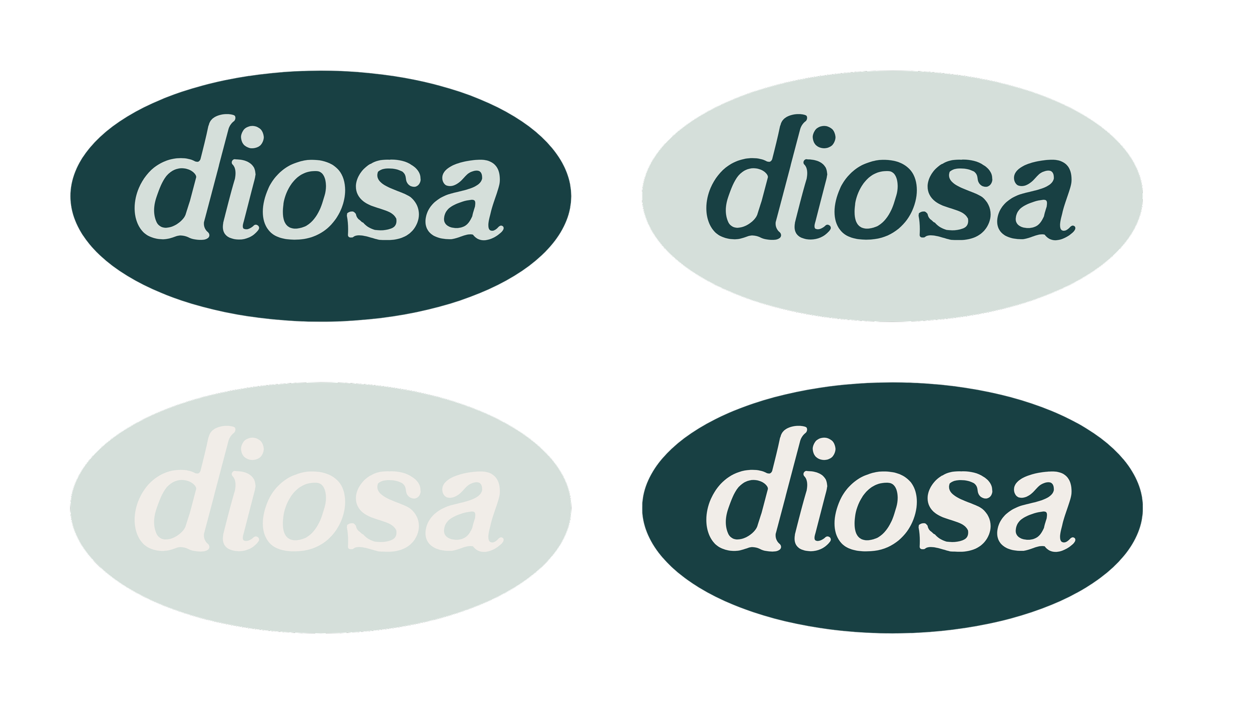
El Hidrant is an old serif font with slashes. It was created in 2020 by modernizing an old eighteenth-century typeface. It embodied everything that I wanted my app to be.
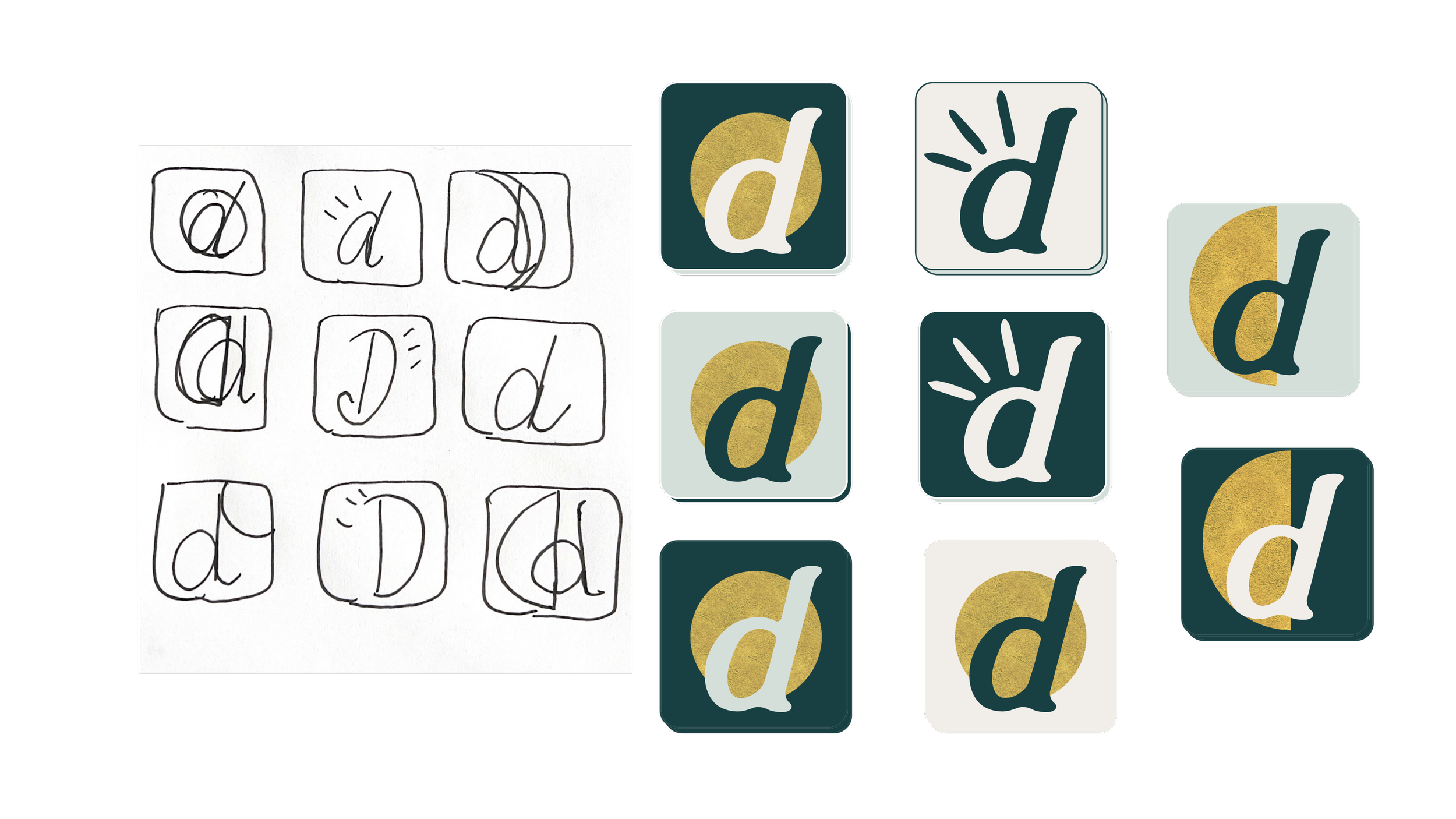
I implemented the colors that I choose for my app into every icon. The gold shapes are meant to represent the phases of the moon. This was a tough choice and I had trouble deciding because the gold accents accentuated the "d" so much. I love the look of the lowercase d's because they looked so elegant. My family group chat agreed on this icon.