Farmy Box
For this case study designers were given the topic of tackling the issue behind food waste.
Role: UX Designer/ UX Researcher
Timeline: 2 Weeks
Tools: Figma, Invision
Team Members: Anabel Fernandez (me), Matthew Dea. Bezawit Debele, Stephanie Gysler, Rachel Figuracion
Research
Our team was tasked with creating a solution that tackles food waste. During our primary research, we discovered that:
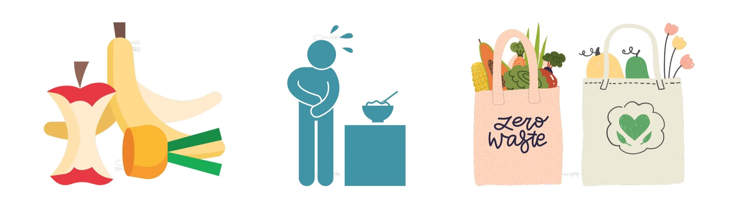
Around 30-40% of food that farmers around the world produce is never consumed
We then looked into communities that are often affected by not having enough to eat. Among low-income communities, college students had high statistics. This led us to the conclusion that food insecurity is common among college students.
We wanted our problem space to incorporate college students and farm produce that would otherwise be discarded
While conducting our secondary research we found that approximately 15% of all food produced on farms each year never gets harvested or makes it out of the farm due to labor shortages, cosmetic imperfections, weather events, and more
34% of college students experience food insecurity
while
60% of college students aren't eating the recommended amount of fruits and vegetables every day
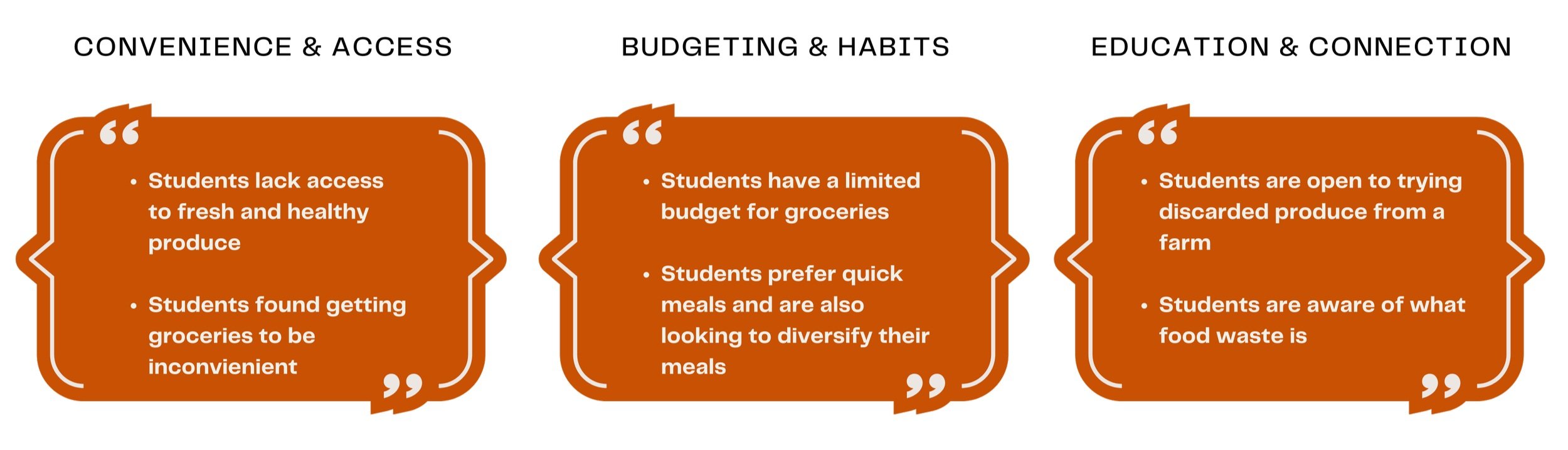
We interviewed 8 college students on their current habits and practices around grocery shopping, access to food, and what food waste means to them. The general recurring themes were:
Empathize
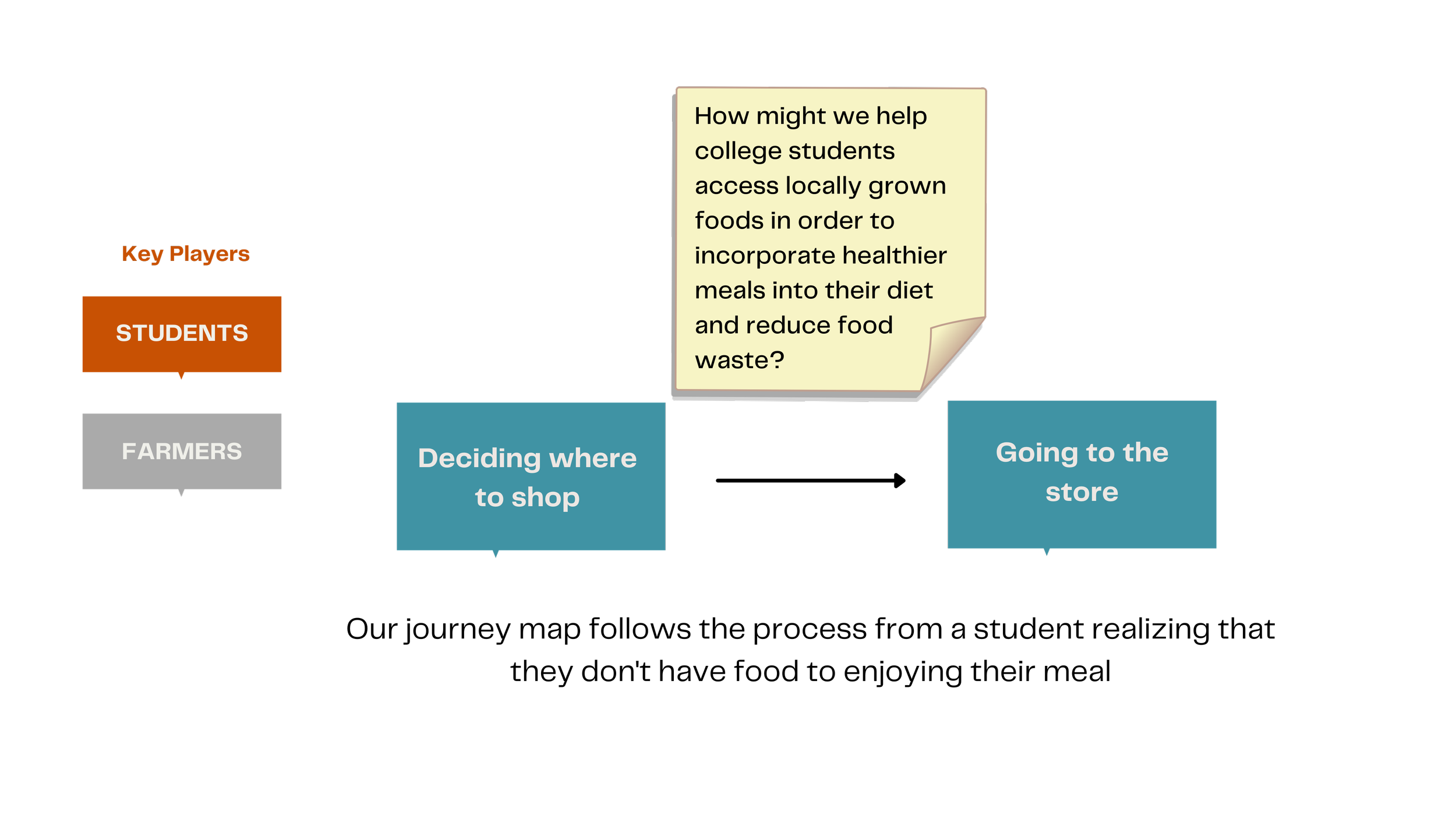
Using our primary research we came up with a journey map highlighting the user’s current journey. Our journey map follows the process of a student realizing that they don't have food to then enjoying their meal. We identified that the student's main pain point was between deciding where to shop and going to the store.
This led us to our user persona.
Create
We created a mood board to set the tone for our app. Each team member also contributed a series of sketches. We created a color palette and choose our desired text styles. We looked towards platforms like Behance and Dribble for inspiration, below are some examples of inspo we found.
After deciding which sketches we saw fit and creating a style guide we turned our idea into wireframes.
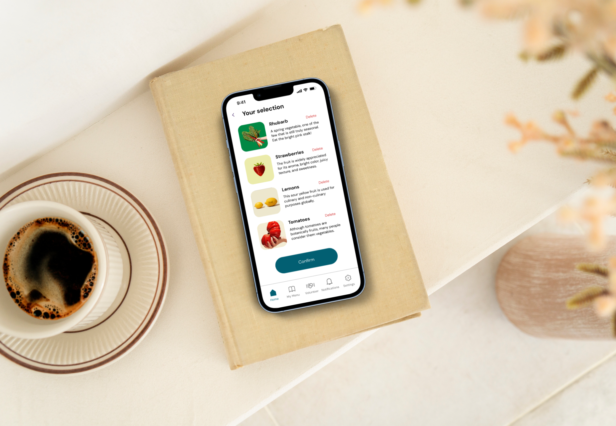
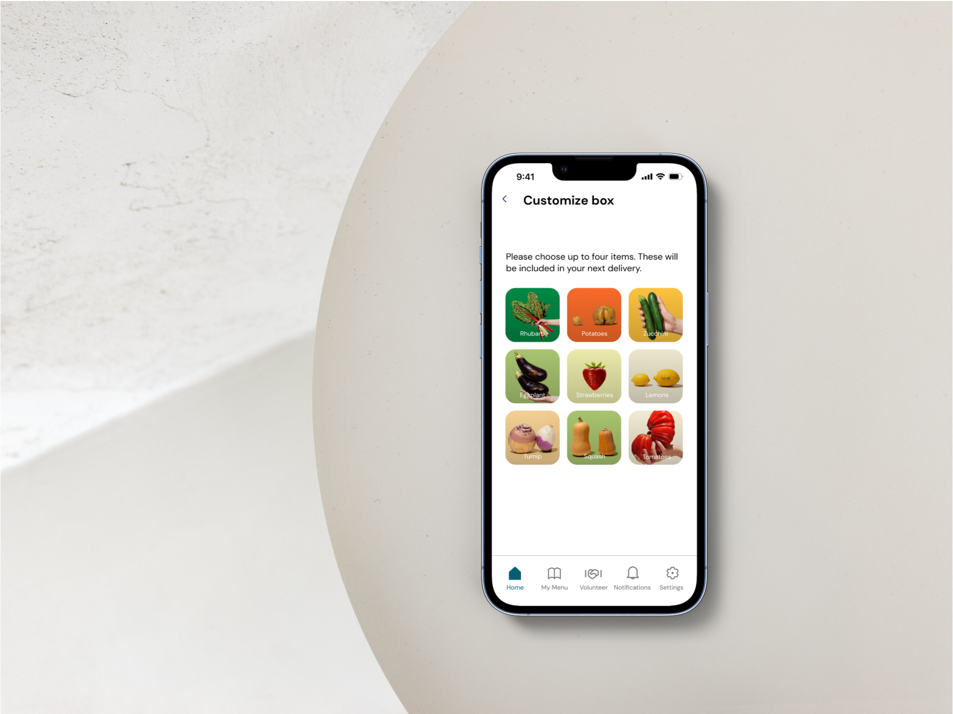
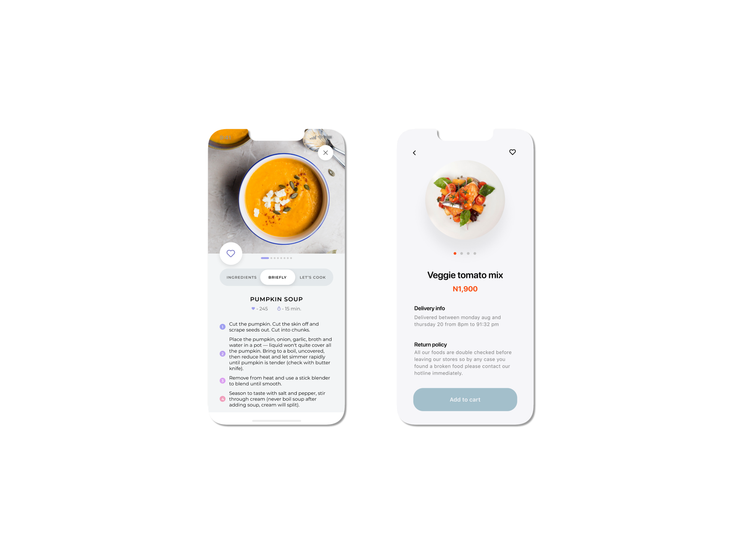
Introducing Farmy Box, Our app strives to give a personalized and easy-to-use experience for students choosing healthy food options. With rich visuals and the use of our primary blue color, our users can easily access different tabs and information.
With the Farmy Box app, you can activate your subscription with just the click of a button. Users can choose from a rich assortment of specially picked seasonal produce and add it to their box. a delivery in progress screen is also available that helps the user track their box’s arrival.
Our Invision prototype
Test & Develop
Our design sprint allowed us one round of usability testing to guide us in further developing our product. Through our usability testing we discovered that:
When asked where to find recipes, all users wanted to navigate to the My Menu tab of the nav bar instead of the home tab
Users wanted to know how Health Score was calculated and suggested clarifying 'm' to 'min' to indicate time instead of measurement
Our next steps
1 Develop the farmer side of the app experience
2 Develop the farm assistant feature which gives insights into local farms
3 Add a feature to hold users accountable for reducing their food waste
Key Learnings
Keeping the Figma file organized will keep the team organized
You are not the user, you can empathize but you aren’t creating for you
It’s important to take time to share the ideas of everyone involved in the group