ROLE: PRODUCT DESIGNER/ UX RESEARCHER
TIMELINE: 8 WEEKS
TOOLS: FIGMA, INVISION, THE LANDING, ARTBOARD, PHOTOSHOP
WHERE DID THIS IDEA COME FROM?
When my best friend was pregnant, dressing her body was one of her most significant issues. I remember the countless hours spent looking for a work-appropriate pantsuit and how time-consuming and expensive it was. There were honestly no easy solutions, and the more stores we went to, the more disappointed we became. The options were minimal, and any garment she invested in would be worn briefly. I vividly remember her saying, “I wish there were a way I could wear these clothes and send them back.” The seed was planted that day and sprouted almost a year later in this case study.
TIME FOR EXTENSIVE RESEARCH
OUR PROBLEM
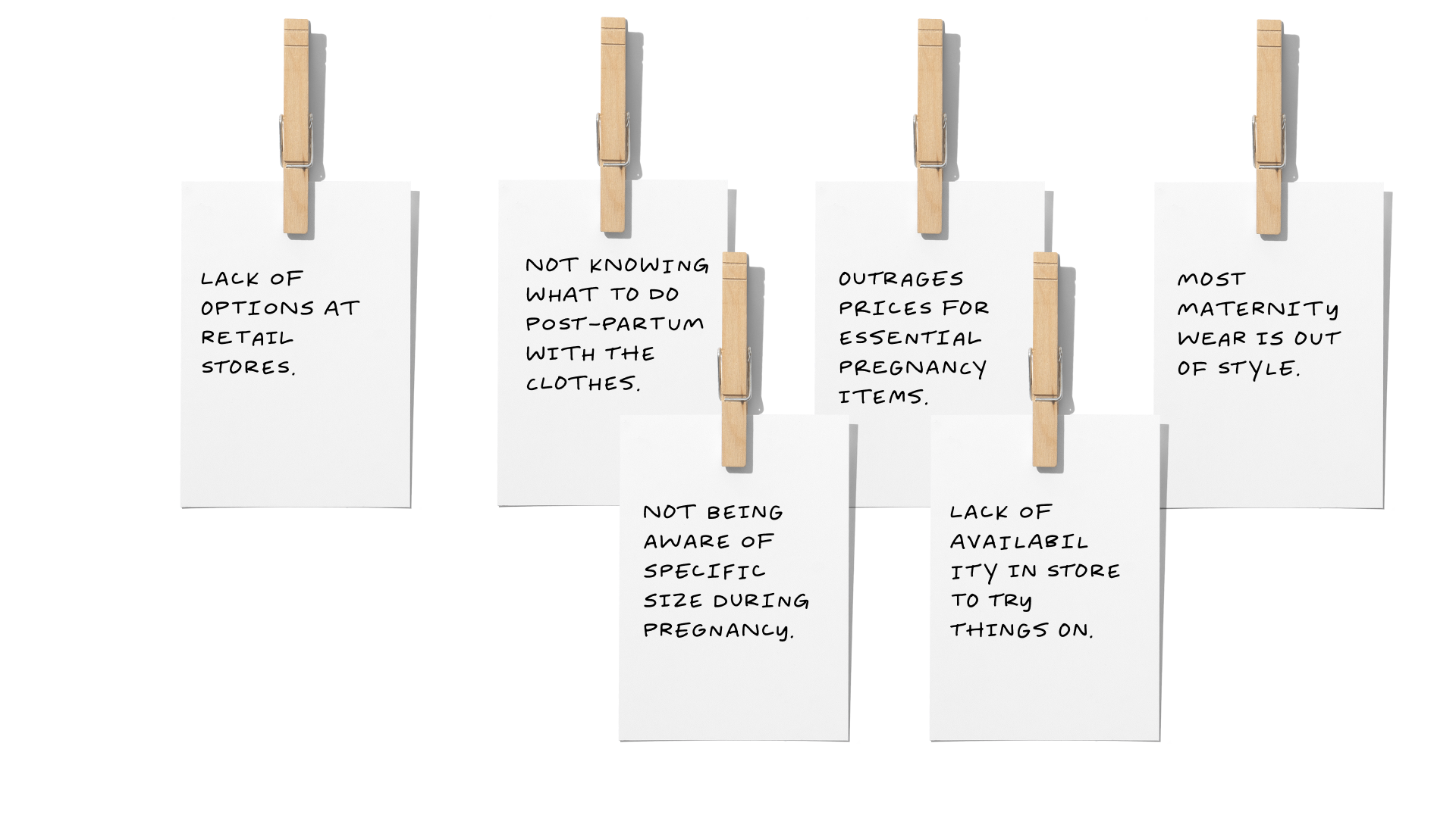
Pregnant women of all ages have trouble dressing their “unfamiliar” pregnant bodies. It’s hard to rationalize a financial investment for a temporary body change. The bump is an accessory that should be accentuated, not hidden, and although women are waiting long periods to have children, maternity fashion is an ever-growing market. The options, however, are far and few in between. Most of the items available are out of budget and lacking flare. It seems as if women must go out of their way to find clothing suitable to their style and needs while pregnant.
WHY IS THIS AN ISSUE?
Clothing is essential, pregnant or not. On top of all the changes that come with pregnancy, transitioning an entire wardrobe while pregnant becomes a hassle. Personal style is compromised; many items aren’t within budget, and anything bought can only be used for a limited time.
MY HYPOTHESIS
I hypothesized that if I could help pregnant women rent maternity clothes throughout their pregnancy while catering to their specific budgets and needs, they would find transitioning their wardrobe less stressful and more fulfilling.
WHAT DID YOU FIND?
THE PROBLEM IN DETAIL
I had a problem space that I wanted to focus on, but who did this issue affect? What is the project goal? And most importantly, what research can I use to inspire a design solution?
Through my secondary research, I discovered that:
EVERY YEAR PREGNANT PEOPLE REQUIRE ESSENTIAL CLOTHING.
There are roughly 4 million births a year in the US; people who do get pregnant require wardrobe-essentials.
MATERNITY WEAR HAS A WASTE PROBLEM.
There aren’t efficient ways to reuse maternity clothing. Although the maternity market is in expanding, there are no options to extend the lives of high-end maternity garments
THE MATERNITY WEAR MARKET IS A 12.25 BILLION DOLLAR INDUSTRY.
Fortune estimates that, on average pregnant women spend $500 and up per pregnancy on maternity clothes. That breaks down to $50-$60 spent per month of pregnancy.
YOUNGER GENERATIONS ARE MORE ECO-CONSCIOUS.
Younger generations are looking toward more sustainable ways of living. The change in consumer behavior and demand for eco-conscious products has led to the ever-growing clothing rental market.
HOW DO PEOPLE WHO HAVE BEEN PREGNANT FEEL?
I INTERVIEWED 3 CANDIDATES WHO WERE PREGNANT AND HAD EXPERIENCE SHOPPING FOR MATERNITY WEAR. HERE IS WHAT THEY HAD TO SAY:
-
"There were not enough maternity options and everything was so expensive, even the things on clearance"
Criminal Investigator, 40-45
-
"Maternity wear is very bland, boring, and ugly. It did not match my sense of style at all"
Stay at Home Mom, 25-30
-
"Now that I think of it, I never tried anything out in the store. There weren't many options"
Probation Officer, 30-35
Each subject had particular pain points, motivations, and behaviors. I used notes to synthesize my interview findings.
Motivations
Pain Points
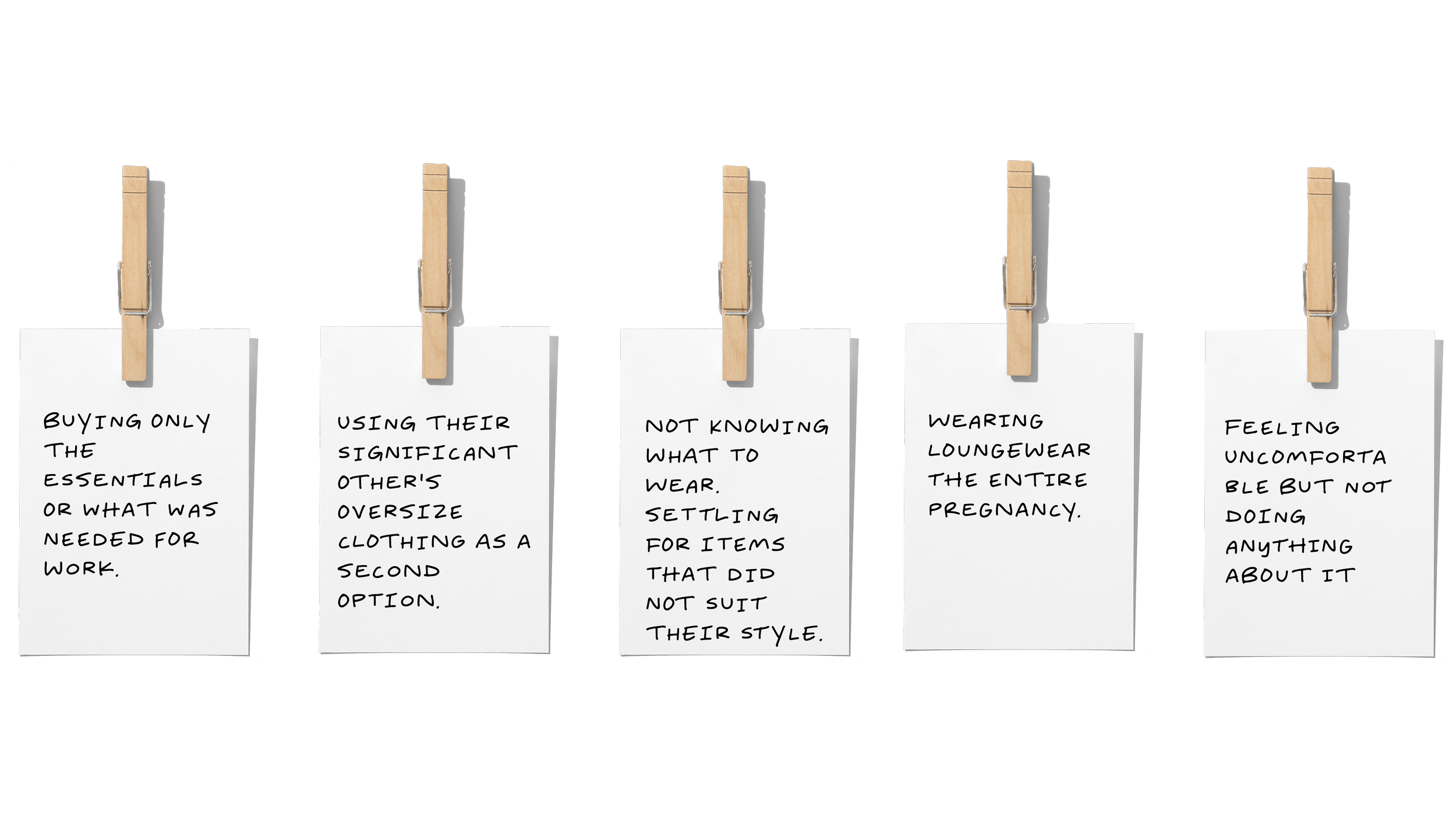
Behaviors
INTERVIEW INSIGHTS
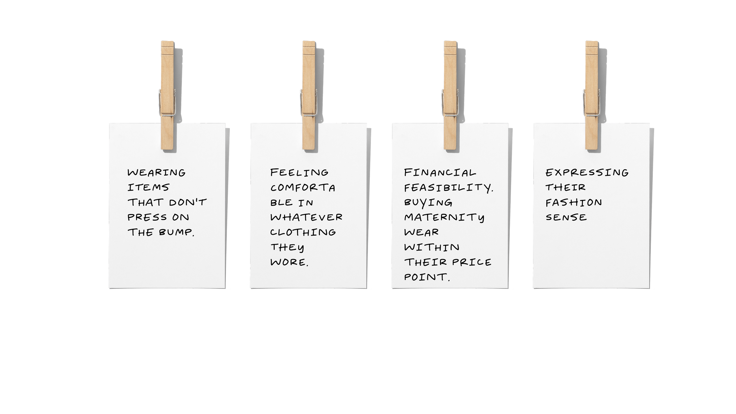
After synthesizing my findings, I gathered four central themes:
Desire to find maternity clothes that fit and resemble their style
Lack of maternity wear within their price range
Prefer to get rid of clothing post-partum
Keen on making eco-conscious choices
My interview findings helped me understand my user’s needs and wants. The time had come to empathize with my user. Using my prior research,
I created a question to help inspire design solutions.
How Might We provide pregnant women with access to ethical maternity wear so they can express their fashion sense while adhering to their personalized budget?
BE THE USER
understanding my user’s point of view
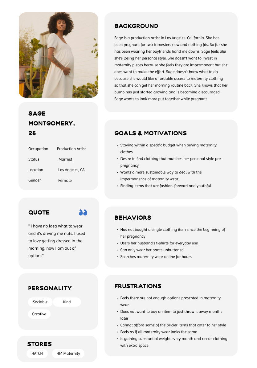
The process of empathizing allowed me to look deeper into my user's situation. I created a user persona based on my primary and secondary research. In this user persona, we are introduced to Sage, a 26-year-old recently pregnant production artist. She is having issues finding sustainable ways to express her style while pregnant and has not found any platforms that present her with the options she would like.
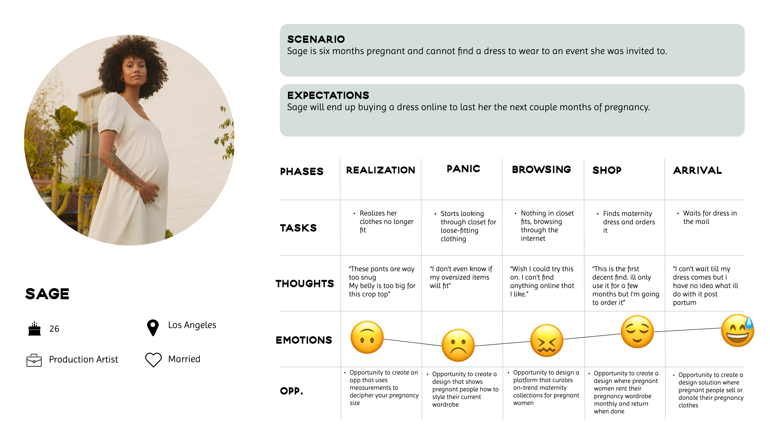
The user experience map is a way of visualizing the experience that a customer goes through while using a product or service. This one, in particular, helped me figure out areas of design opportunities in sage’s current journey.
What is happening in this experience map?
Sage is six months pregnant and cannot find a dress to wear to an event she was invited to. This experience map shows her journey from realizing nothing fits to receiving a maternity dress she bought online. On the bottom, there are listed opportunities for design intervention.
Creating user stories
our users perspective
User stories are short statements written from the perspective of the user. After creating the user persona and experience map, I started authoring user stories from my persona’s philosophy and all the roles they take on in their day-to-day. I narrowed all my user stories into epics and eventually chose a core epic and a user task to center my task flow on.
CORE EPIC: platform navigation
User Task: As a pregnant person, I want to navigate a convenient rental maternity platform so that I can rent items that fit my growing belly bump
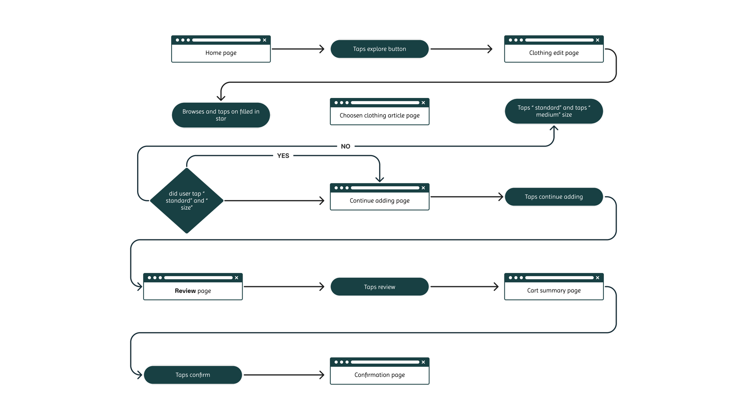
user task flow
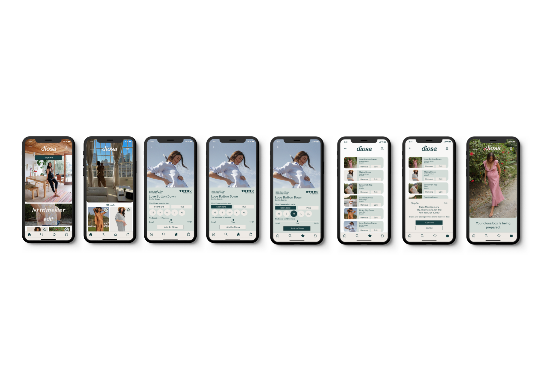
The user task flow demonstrates the steps my persona would take to complete the specific task listed above within my design solution. The task flow also determines the pages that must be designed when sketching.
the act of creation
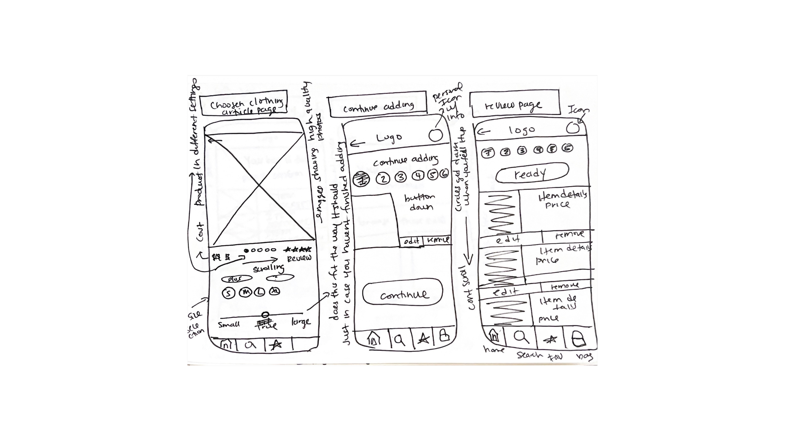
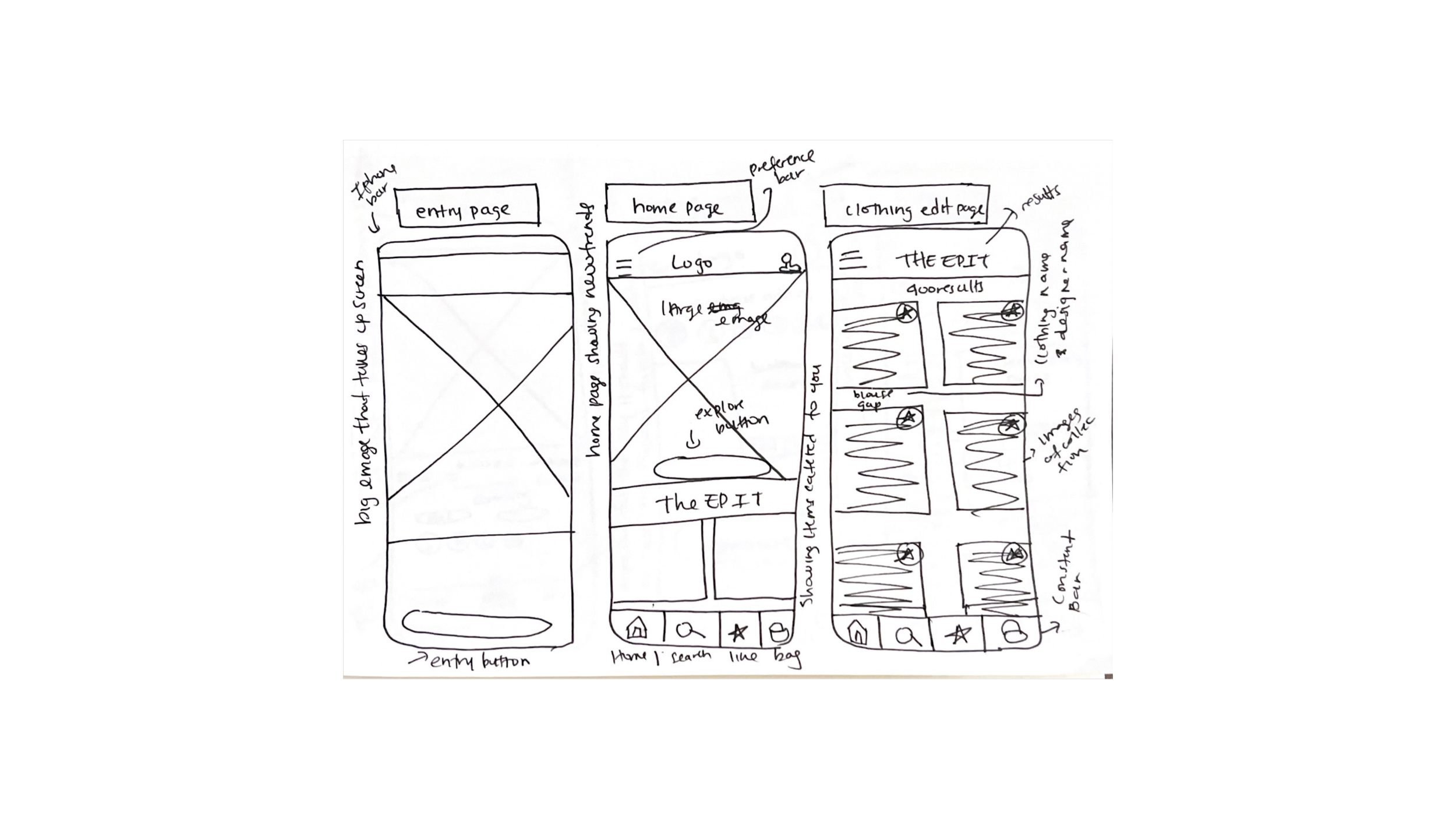
starting off by sketching
The user task flow, and a UI INSPIRATION BOARD, guided when creating these sketches. I began creating exploratory sketches to express some simple inspired ideas and then began creating more elaborate solution sketches.
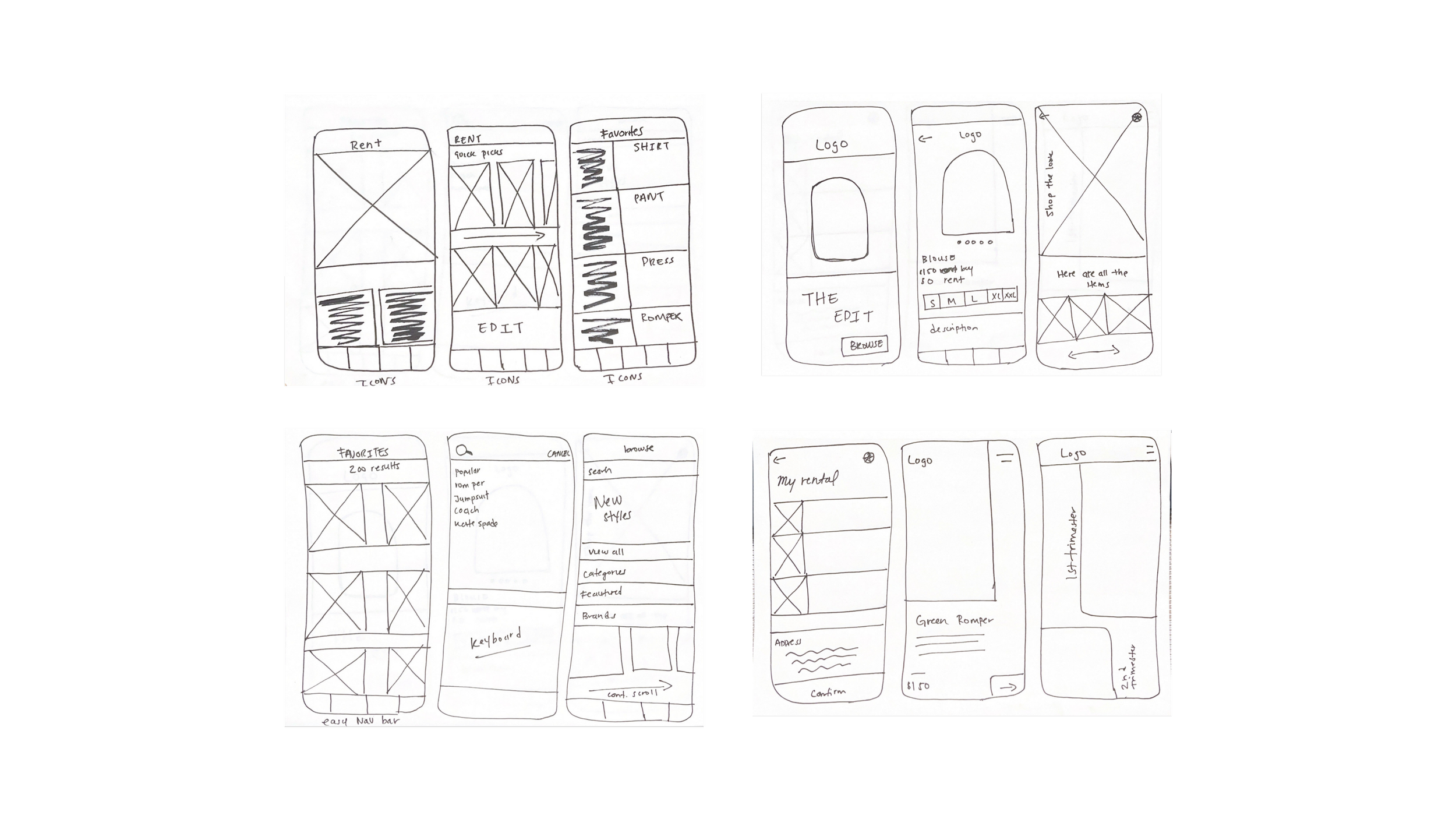
mid-fidelity wireframes
After finalizing my solution sketches and selecting which screens I liked enough to incorporate into my design, I began creating the first version of the mid-fi wireframes. If I’m honest, I usually always start designing with color, so this was difficult for me.
Testing. Testing. testing
figuring out what wasn’t working
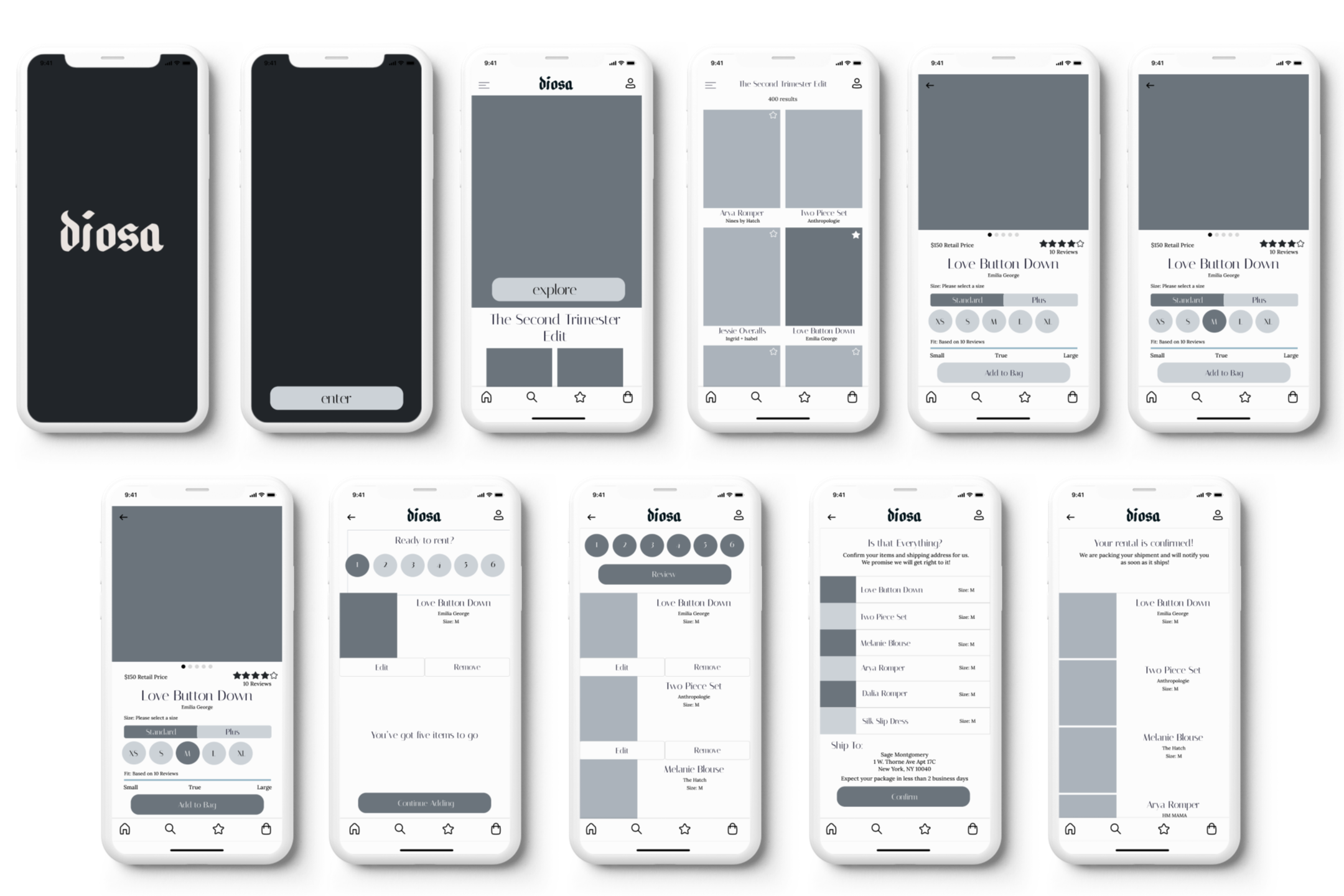
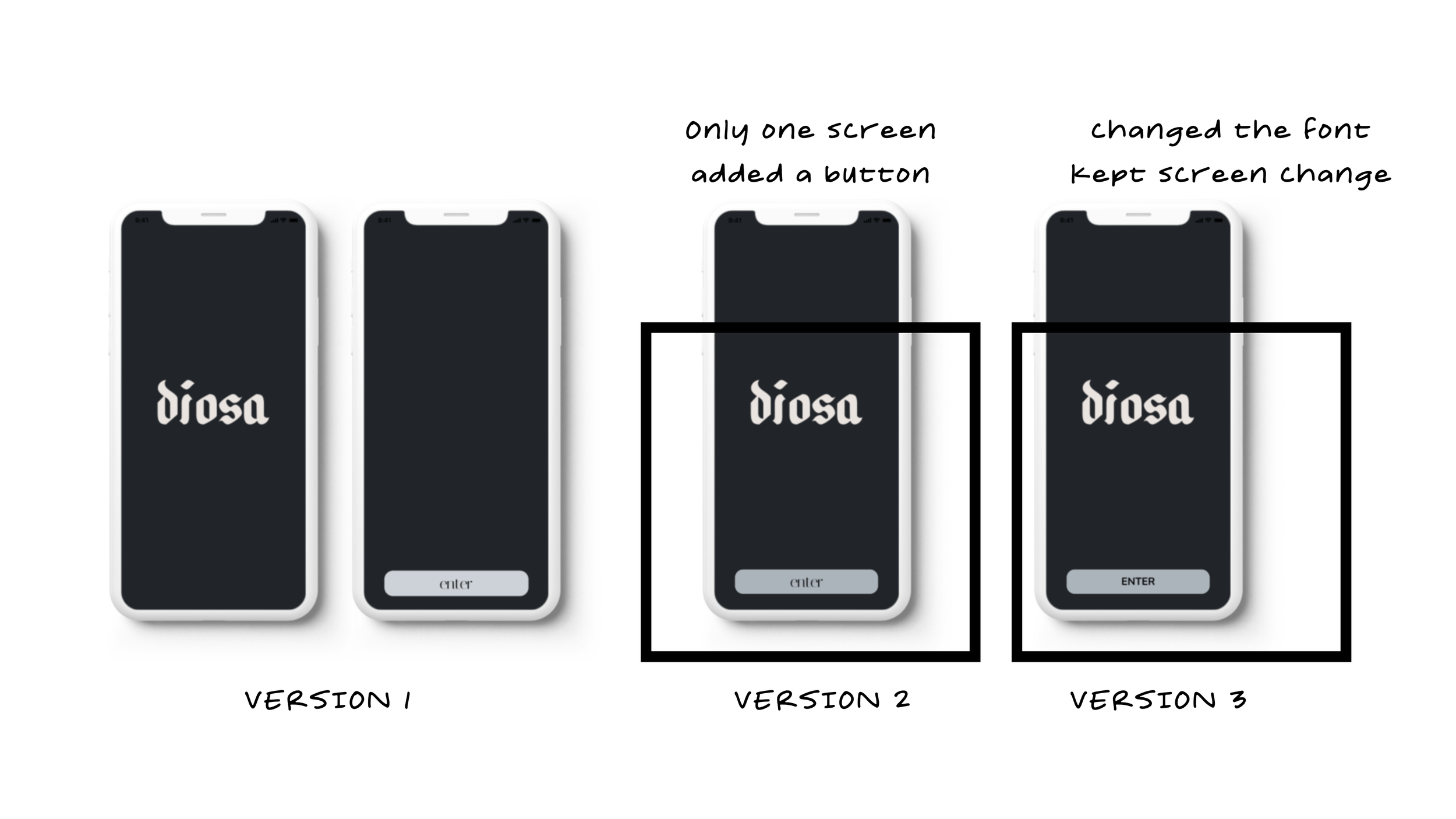
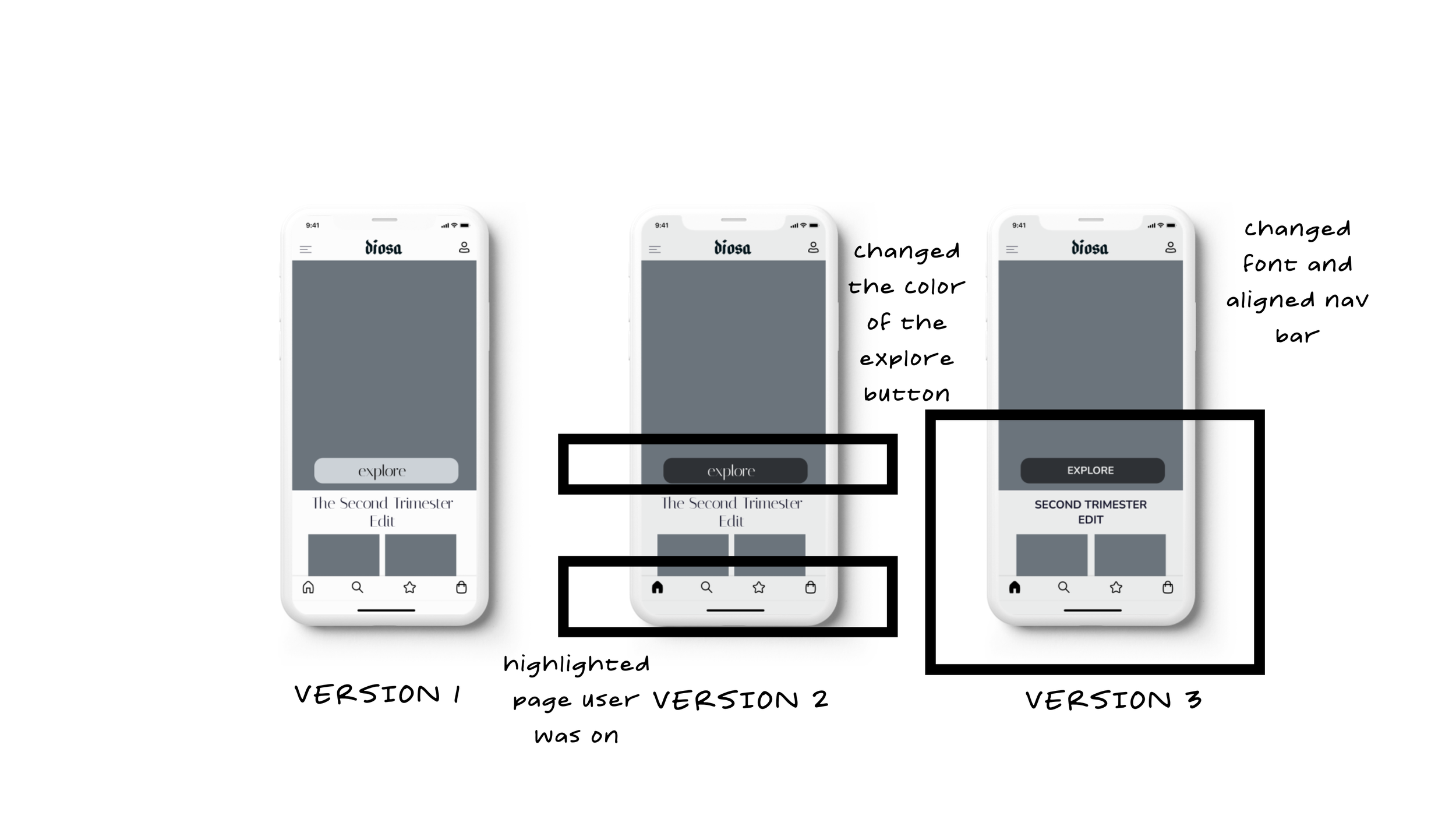
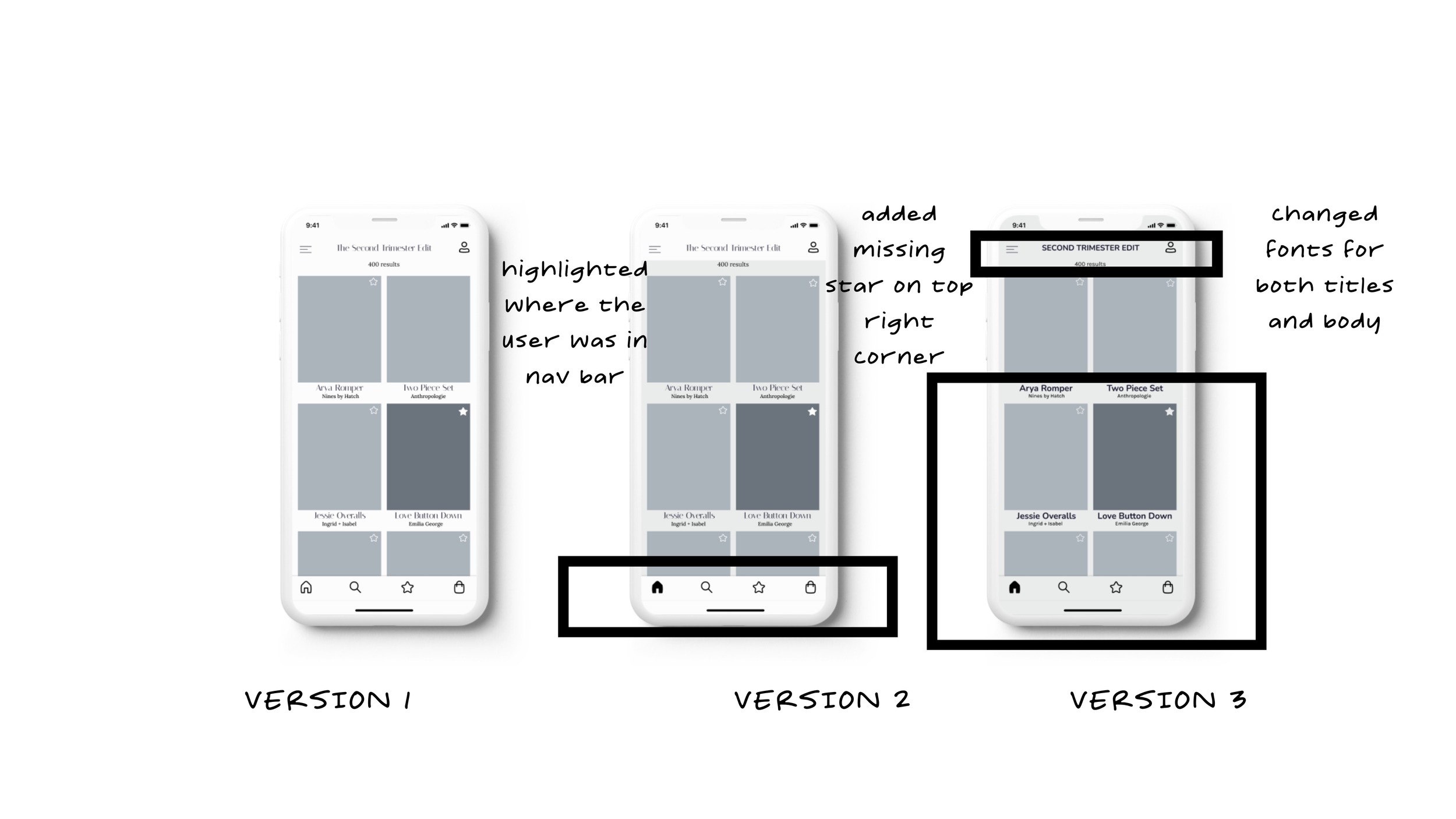
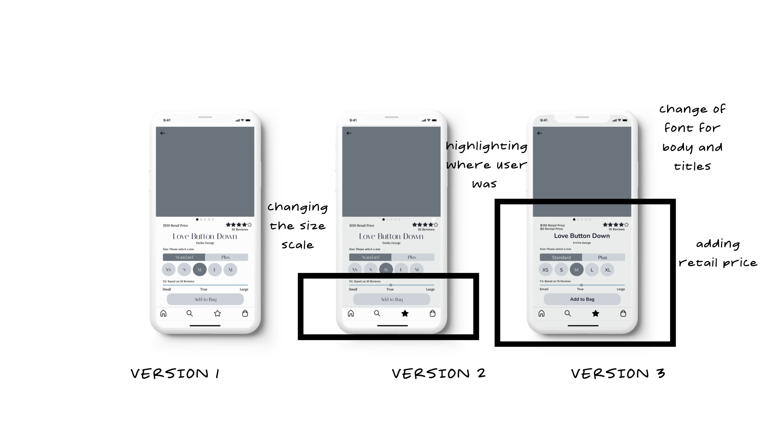
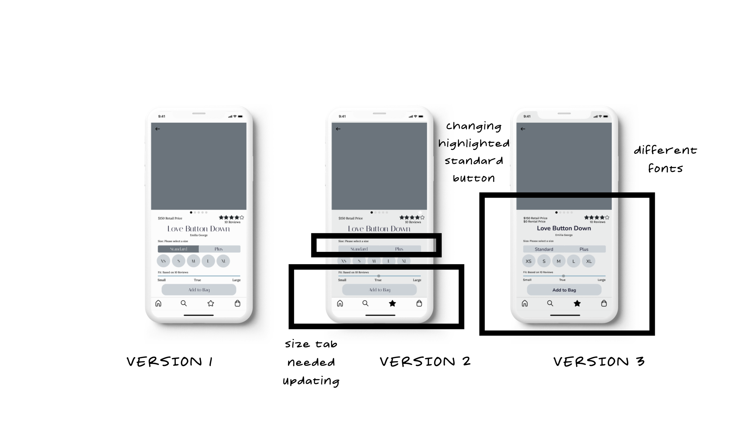
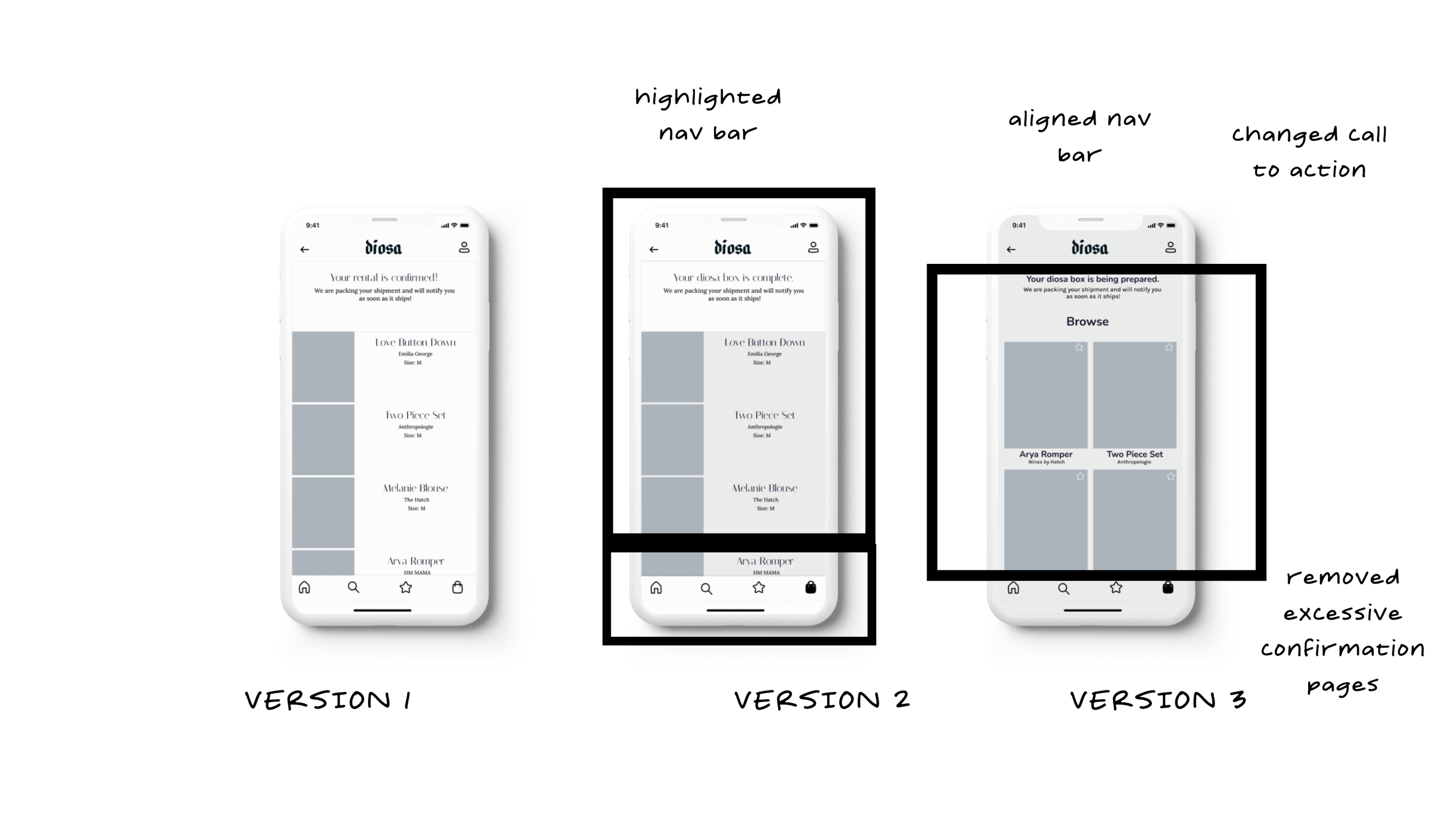
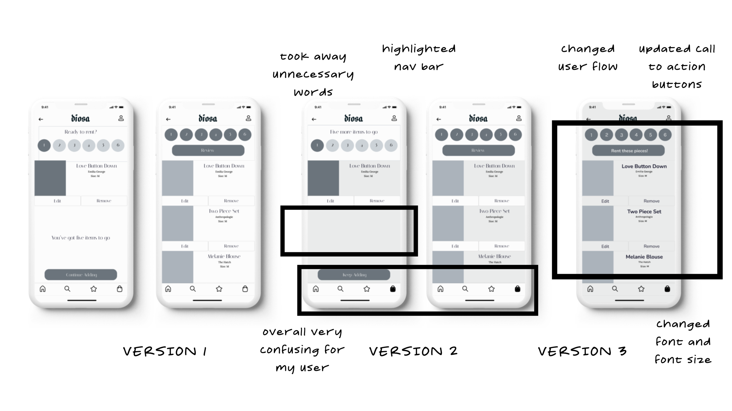
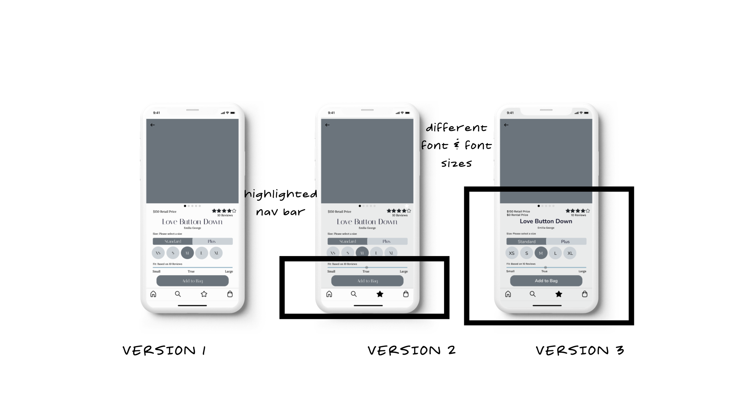
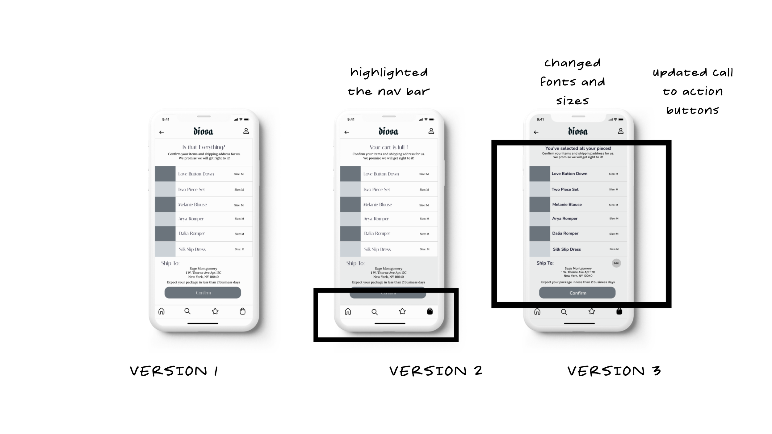
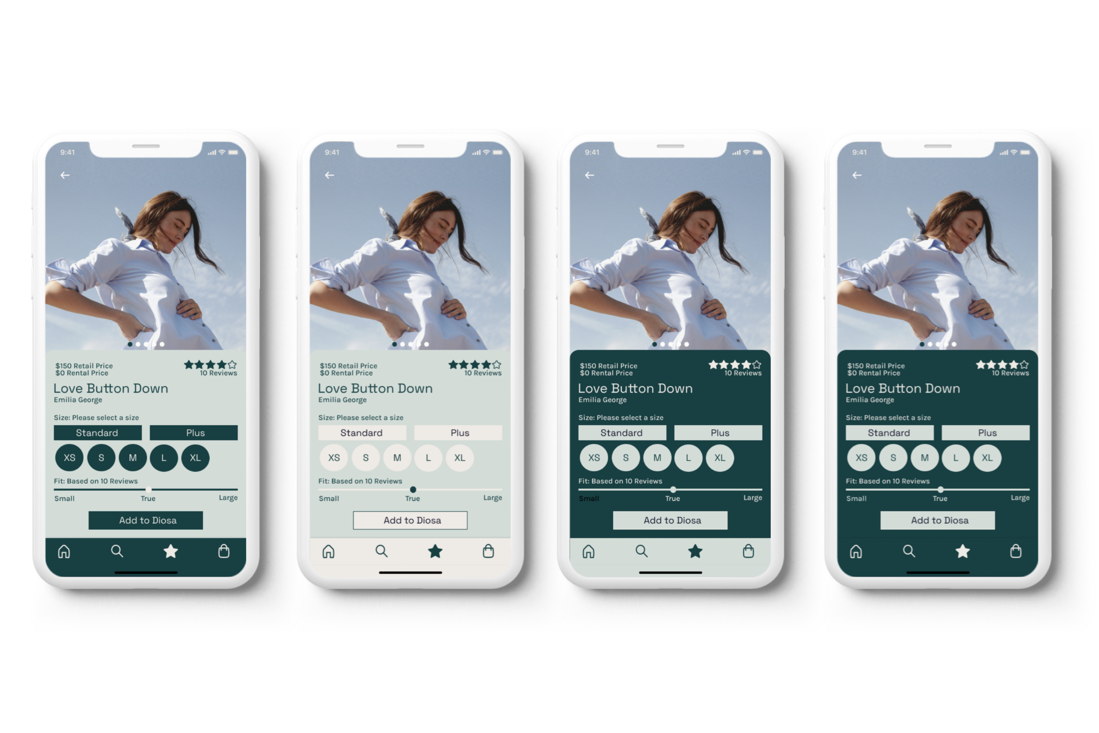
When the first version of my wireframes was finished, I conducted two rounds of user testing. Each round consisted of five users. I sent my prototype in advance and allowed each user to go through the user flow while taking notes on what areas needed significant changes. After each round, I created a design prioritization matrix and implemented changes that required low effort but had high user value. Below are the three versions of each prototype, along with the highlighted changes I made each round.
the production
words and moodboards
How should this brand feel?
After updating my wireframes post-user user testing, I had to produce the brand identity of my design solution. I was very excited about this part of the design process because my mind was filled with ideas. I created a few statements to describe what the brand should feel like:
more airy than stuffy
more retro than modern
more spring than winter
more refined than undeveloped
more bright than dull
more transcendent than ordinary
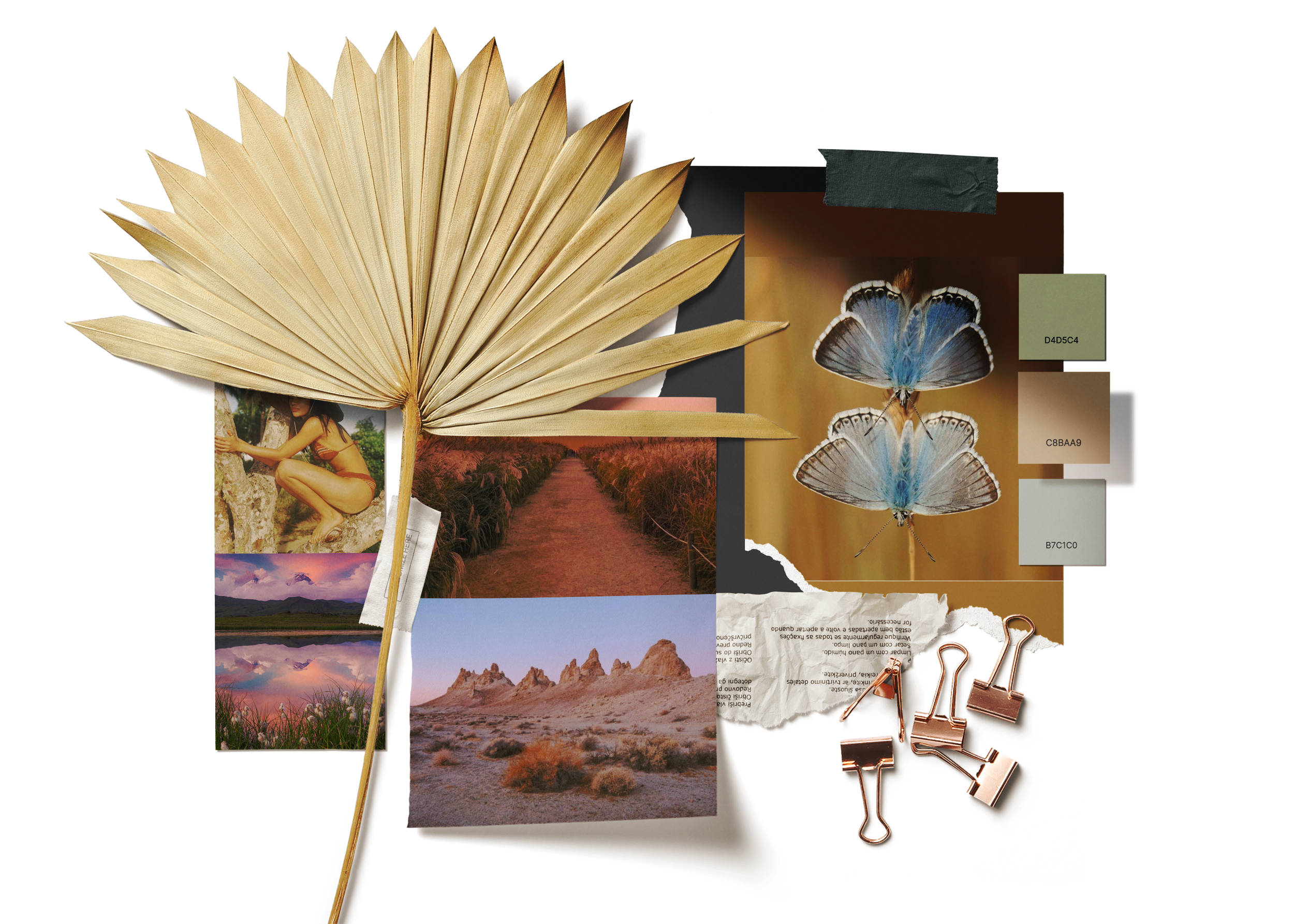
I went ahead and created a mood board with pictures to describe the feeling I was trying to evoke, as well as create a UI board full of inspiration. If I could sum up my mood board in one word it would be ETHEREAL.
color injection
Trial and error
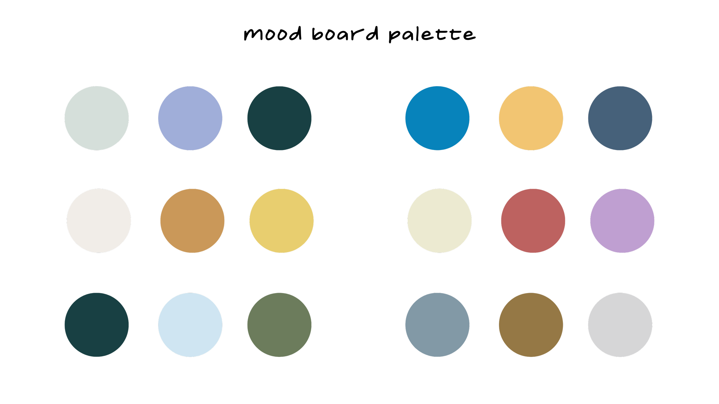
I took many colors from my mood board and put them together in a palette to create color combinations to inject into my finished wireframes. I spent hours experimenting. As much as I wanted my design to look a certain way, I also wanted it to be accessible. I decided to use an accessible palette builder to create for AA level or higher and enable all users to enjoy my content. In the middle of my search, I became obsessed with implementing some form of sage green. I wanted my colors to feel earthy and soothing. I ended up using two versions of green in my color palette.
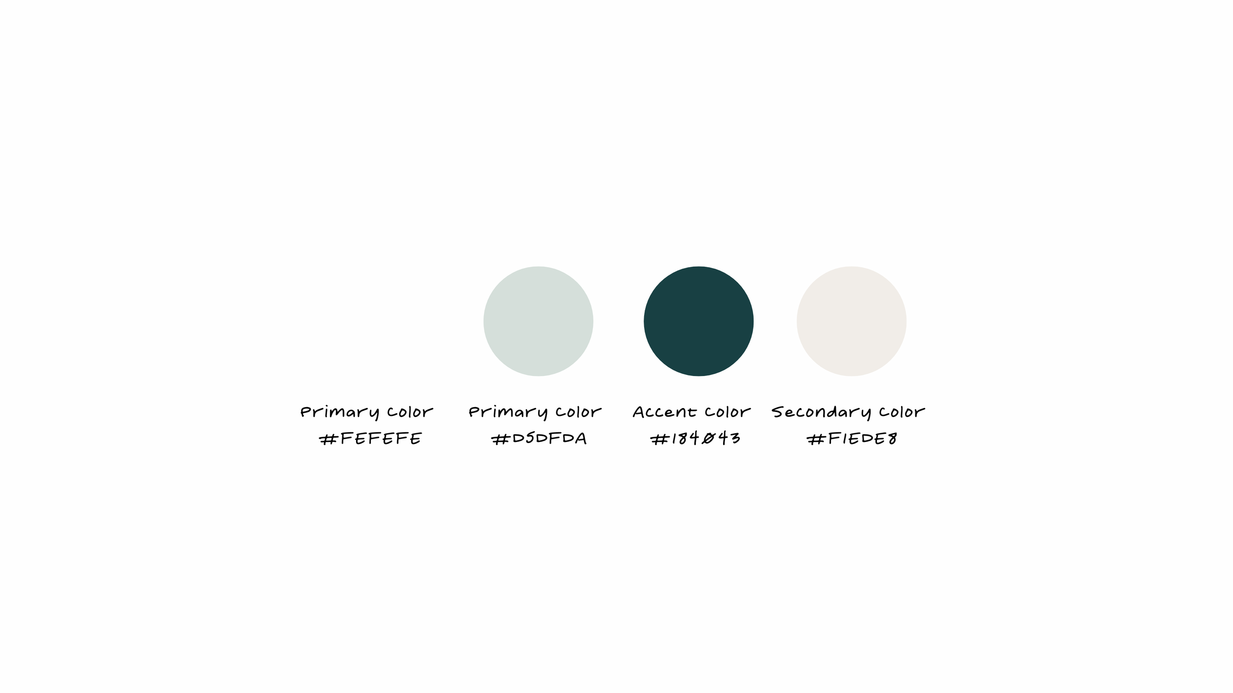
Examples of color implantation
Ok cool, but what did you name it?
Brand name exploration
While studying Art History in college, we learned about ancient temples that worshiped pregnant people. Most early civilizations believed these people had a closer bond to god consciousness due to their ability to conceive. In their way, these people were gods/goddesses. In Spanish, the word god/goddess translates to "Dio"/" Diosa" in Italian, "Dio"/" Dea." I went back and forth between the two languages and the masculine and feminine versions but ultimately chose the Spanish version "Diosa." Through this app and this name, I wanted to give power back to the conscious creators of the earth, the people who will ultimately be using my app—the Diosas.
experimenting with fonts and app icons

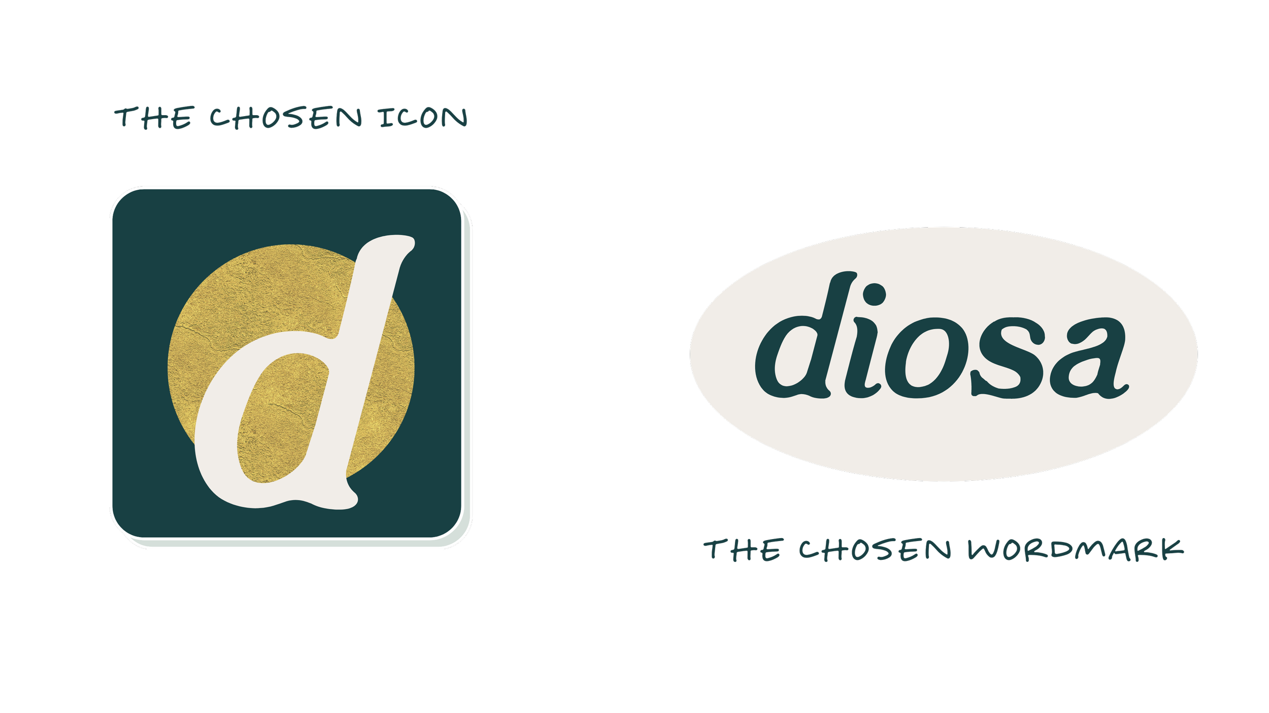
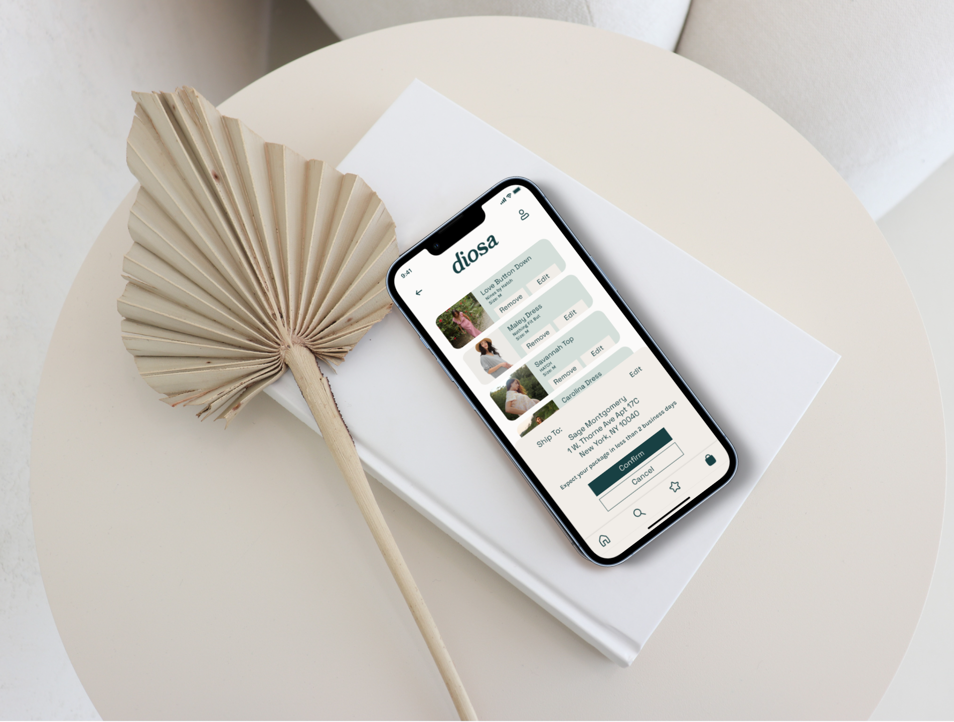
Before the plastic bag ban in 2020, NYC’s bodegas used to give out white plastic bags with the red font on them that read “ Thank You for Shopping With Us.” That font is called Bookman Old Style, an 1800s serif typeface. I knew I wanted something similar, and while looking through the creative market for typeface inspo, I found “ the one .”El Hidrant is an old serif font created in 2020 by modernizing an old eighteenth-century typeface. It embodied the style I sought after. I experimented with many other fonts just in case there was a style that inspired me more but nothing compared. I created the icons after a much-needed sketching session implementing colors from my chosen palette. The gold shapes represent the phases of the moon. The decision was tough, but after a few hours of going back and forth in my head, I decided on the icon and wordmark above.
and now for the grand finale
There were levels to this. I learned a lot.
tarot cards of tech: the service dog
If your product was entirely dedicated to empowering the lives of an underserved population, what kind of impact could you make?
There are pregnant people all over the world that need support. I would love to develop programs that serve low-income parents. I also think it's essential to change the current stereotypical narrative many people can give birth ( no matter the label), and I would love if my product created space for them. This product could modernize how people view maternity wear and their transitioning bodies. I would also ensure education was available for all people preparing to give birth. There is a constant lack of education and resources public for pregnant people. I want my product to empower those that CHOOSE to deliver.
How would a community of your most passionate users behave?
A community of my most passionate users would be full of diversity and constant encouragement. I want my users to support each other through all aspects of their journey. My most passionate users would be compassionate, empathetic, understanding, caring, and above all, KIND. I want to create a community that empowers and brings peace and understanding.
my key learnings
research is extremely important and should not be overlooked
My primary and secondary research created the foundation on which I built my design. If it weren’t for all the hours of research I did to understand the problem space better, I would not have much input to base my design decisions. Without research, I would be creating without direction.
K.I.S.S ( keep it simple stupid)
Could you keep it simple? In a different setting, I would constantly be making updates and adding new features to my product. Certain companies evolve through the years by releasing version updates. I wanted to incorporate so many cool features that, in the end, overwhelmed some of my users, so I learned to keep it simple for my user’s sake.
TEST TEST TEST
There are so many mistakes I missed that my testers pointed out. Even after the first design update, there were still features overlooked. Testing was essential to creating an enjoyable user experience.
THANK YOU SO MUCH FOR READING THIS CASE STUDY. Check me out on LinkedIn.