Role: UX Designer / UX Researcher
Timeline: 4 Days
Tools: Figma, Invision
Team Members: Anabel Fernandez, Stephanie Gysler, Alexa Hare
For this case study, we had to evaluate the usability of a mobile app or website from our company of choice and implement solutions. As part of our design challenge at Emerge Technology, our team decided to work with Italo Treno to evaluate the usability of their existing mobile app. Italo Treno is a company of high-speed trains that connects a total of 13 major Italian cities. They have four seat classes that include Smart, Comfort, Prima, and Club Executive.
What will we be evaluating?
Italo Treno is the official Italo app. It gives users the ability to perform transactions to acquire high-speed train tickets. Users can also create personal accounts that allow them to subscribe to the Italo Piu loyalty program. In addition, the app allows them to search and track trains in real-time.
why change the app experience?
Before our analysis of the app, we looked over user reviews and saw that the app received an overall 2.5/5 rating. Our hope was to provide usability evaluations to help justify reasons to invest in better user experiences.
Houston, we have some usability issues
the problem with the user flow
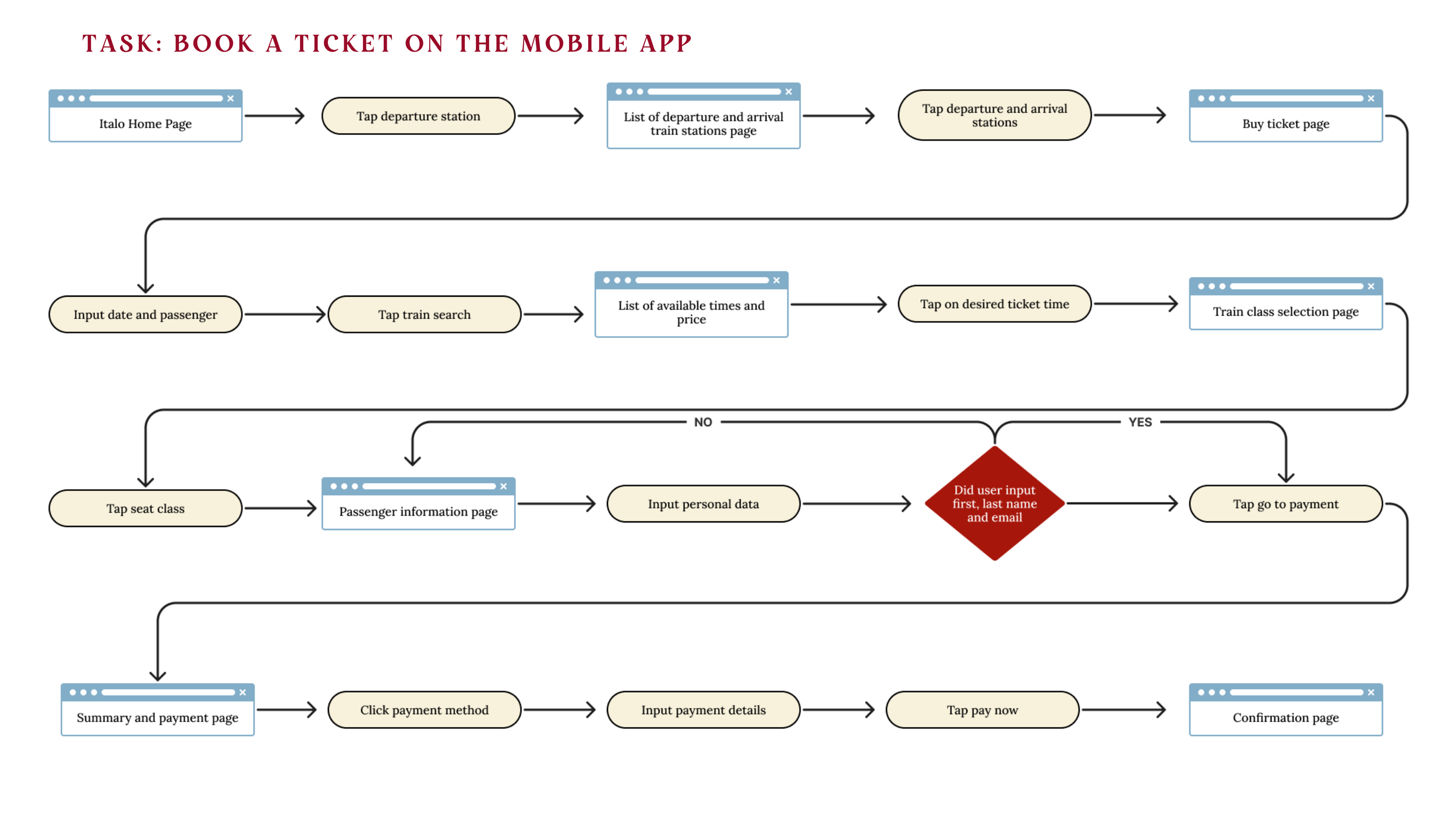
There are way too many screens
The first thing we did was map out the current task flow a user goes through to book a ticket. It is evident from the existing Task Selection Map that users are led through several different screens and inputs to search and buy tickets.
prioritizing design changes
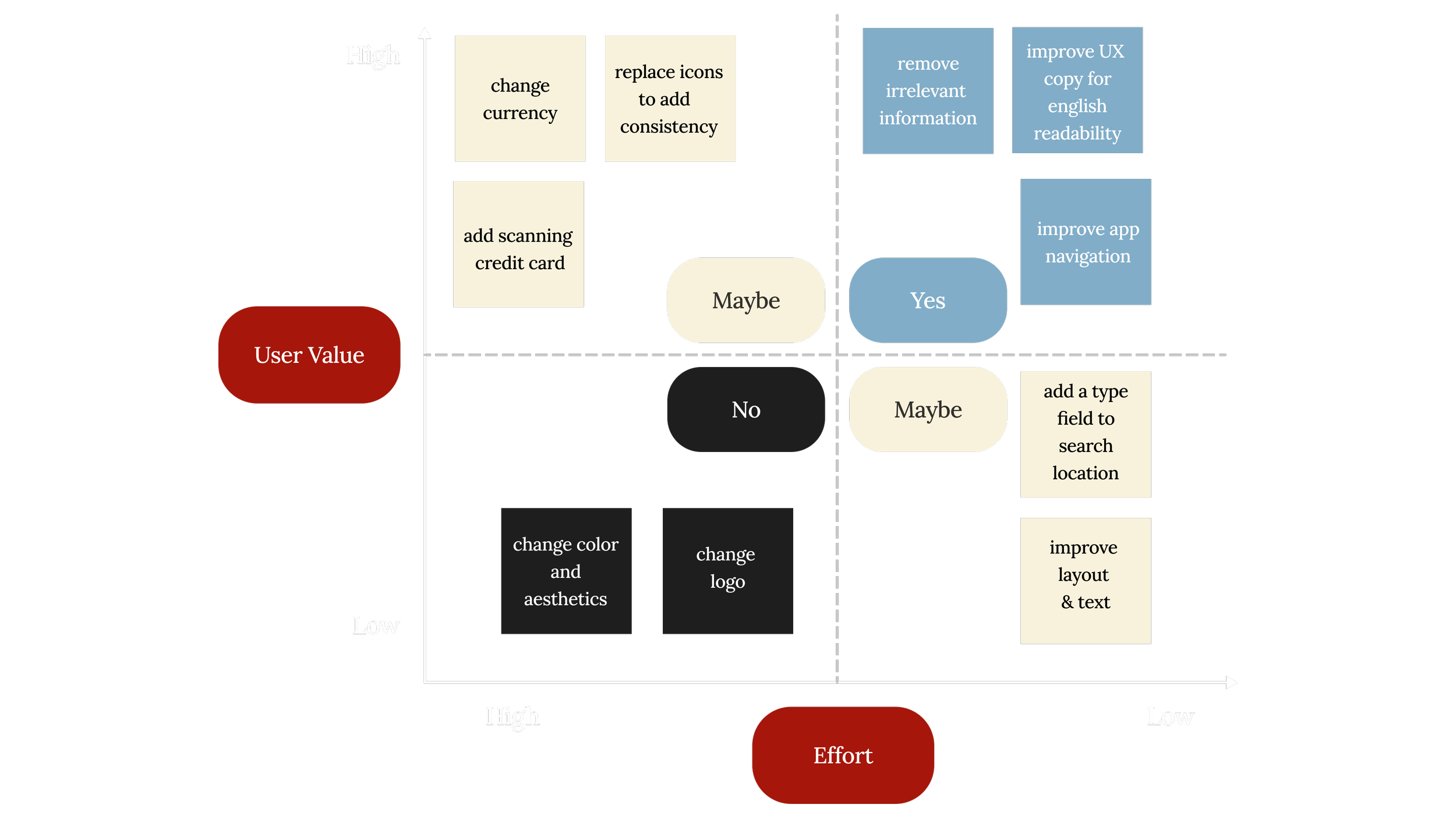
We then plotted the usability issues on this matrix to identify which solutions to address first. We wanted to prioritize changes that were relatively easy to make and had a high user value.
our goals for re-design
Implement solutions to the most pressing usability issues
Work within the existing brand identity for consistency and recognizability
Simplify the task flow for an improved user experience
implementing solutions
In part 2 of our case study, we implemented changes to Italo’s user flow. By doing this, we simplified the task of ticket booking for an improved user experience. The changes we implemented are as follows:
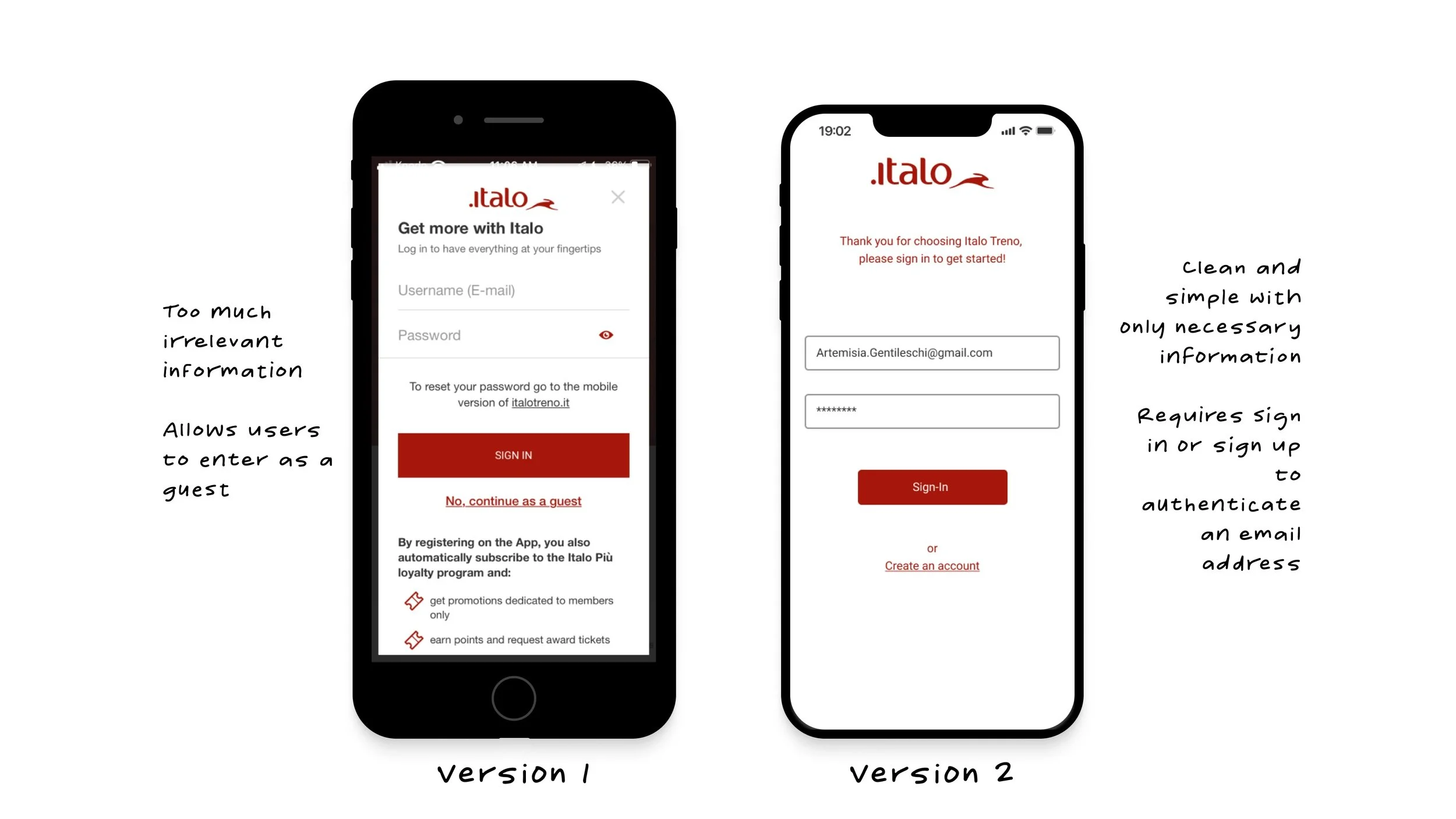
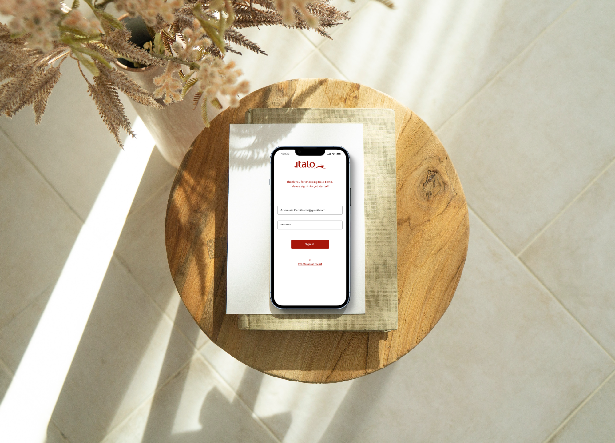
On the sign-in page, there is cluttered informational text that is irrelevant and reduces readability. To limit confusion, we decided to create a familiar standard login screen where users can either log in to their account or create an account. This change also disallows users to continue as a guest which will prevent them from entering an incorrect email.
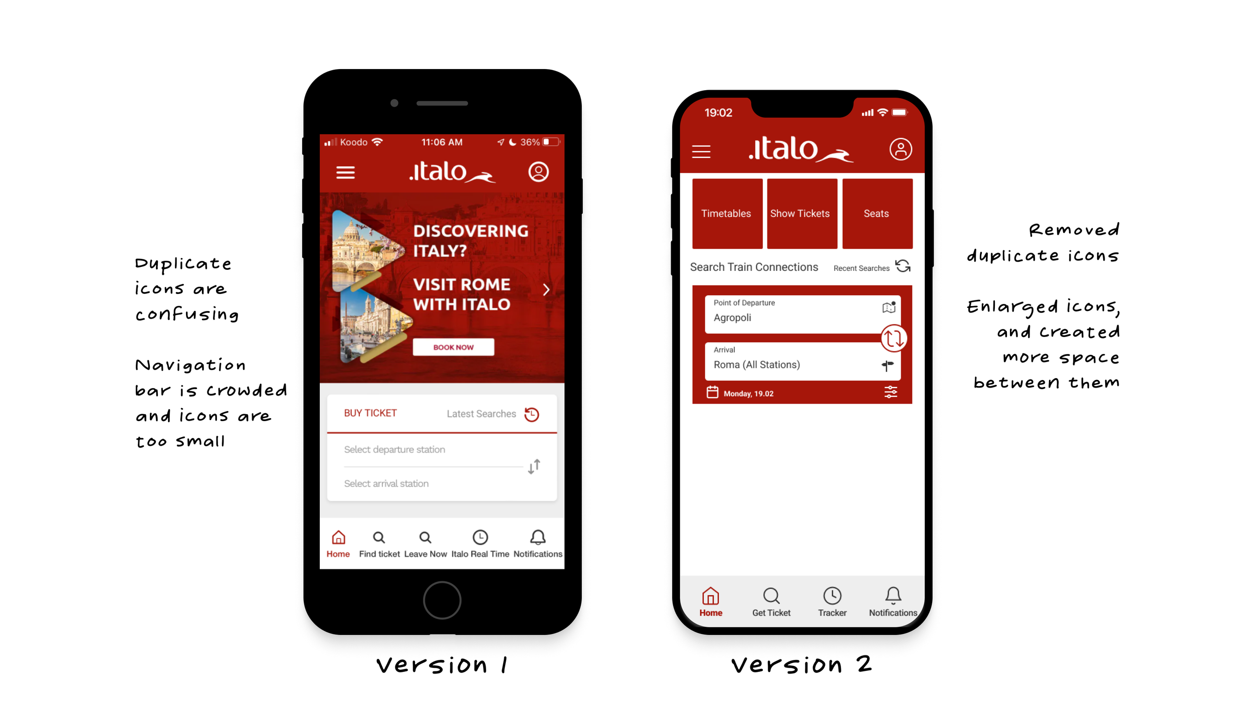
On the homepage screen the two icons for “find ticket” and “leave now” are the same, making it difficult to distinguish. Users are easily misled by the double images and functions of the search icons. When either of the magnifying icons is pressed, the user is led to the same exact page. We improved the navigation by increasing icon size and deleting repeated icons.

On the departure and arrival screens in order to input a departure and arrival station users HAVE to select and scroll from a long list of stations. The cognitive load is high because users are led to several different screens to complete simple actions. In our version, we provided users the opportunity to input text and have the search option load a list of options in alphabetical order.
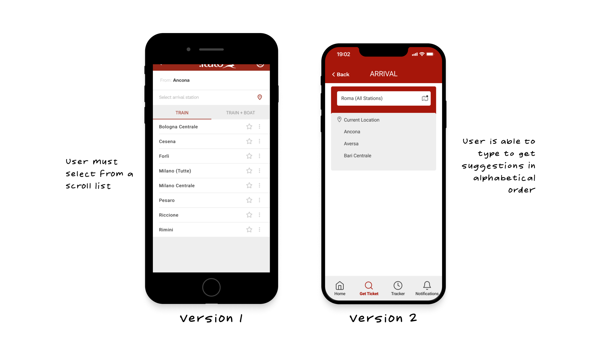
On the departure and arrival screens in order to input a departure and arrival station users HAVE to select and scroll from a long list of stations. The cognitive load is high because users are led to several different screens to complete simple actions. In our version, we provided users the opportunity to input text and have the search option load a list of options in alphabetical order.
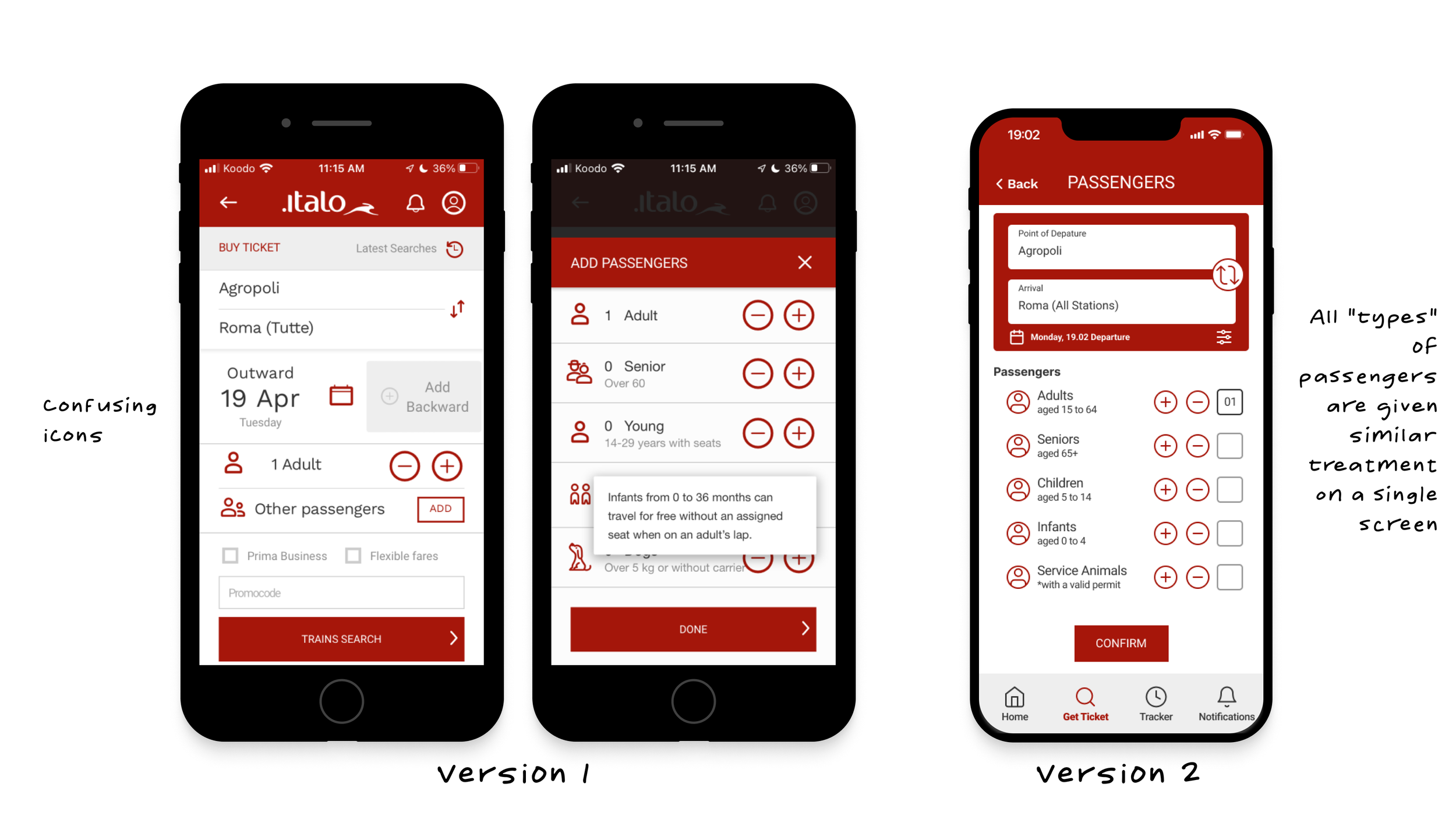
On the passenger selection page, we made all types of passenger options as well as criteria visible on a single page for consistency. We also made it apparent to the user which page they are on at any given moment in the process with a heading and a back button for navigation.
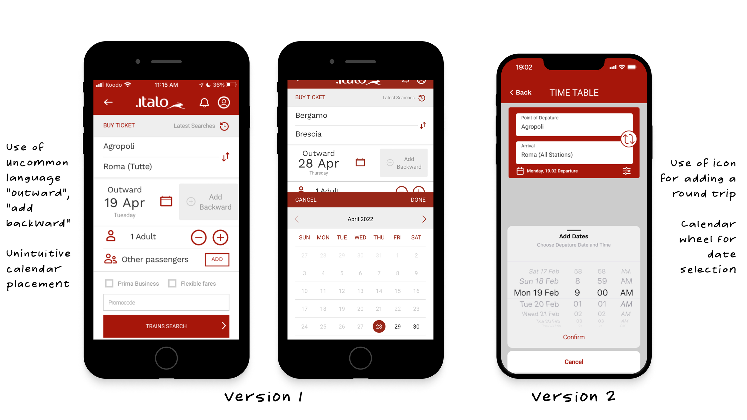
On the search/ date and time screens, we changed some of the language to be more familiar to native english speakers. We used "point of departure and arrival" to label the stations and switched "add backward" to a large icon that allows users to add a return if need be. This helps make the screen feel less crowded. We also added a calendar wheel to increase the usability of the calendar function.
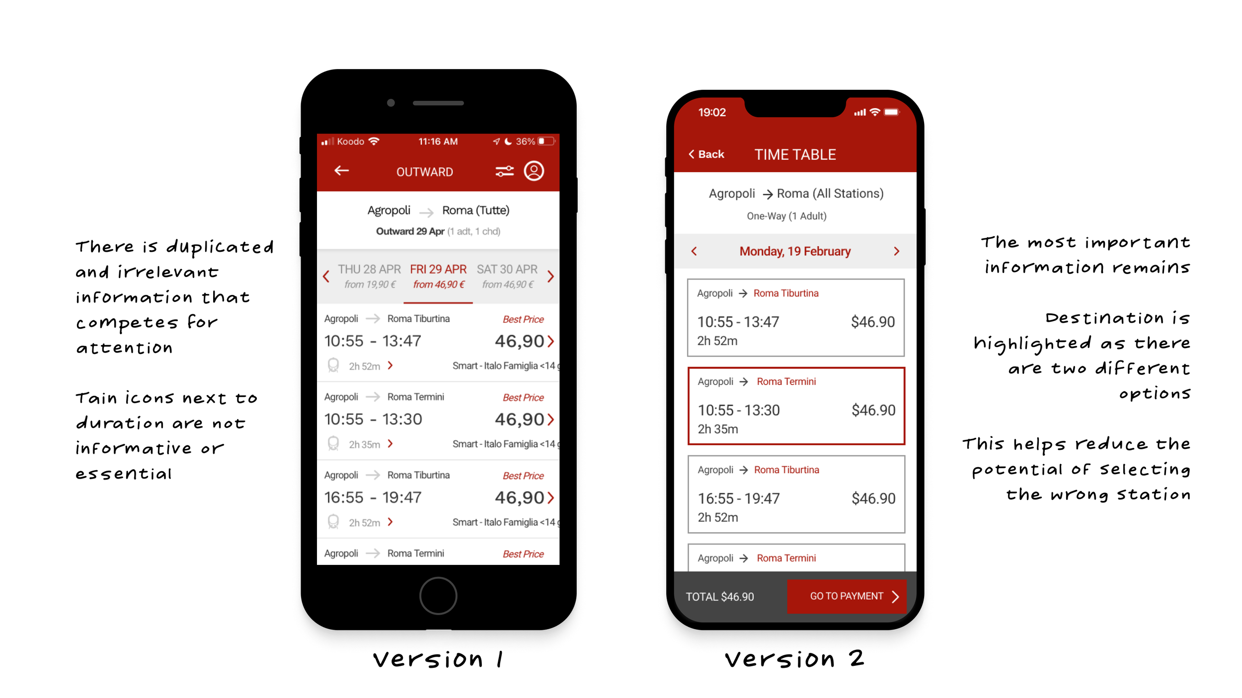
On time table/ train selection screen we removed all duplicate and unnecessary information so that the main focus would be the important aspects of the page. In this example, Roma has two terminals. We highlighted these terminals to draw the user's attention to select the correct option.
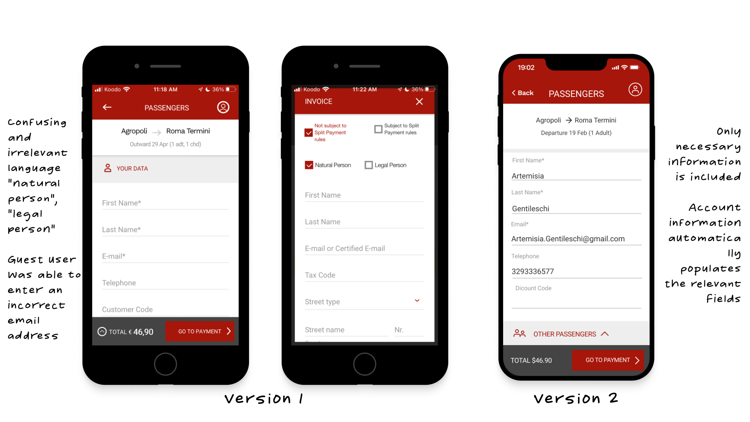
On the invoicing screen, we removed unnecessary check-boxes like "natural person" and "legal person". We also chose to auto-populate the contact information for the passenger from their sign-in/sign-up account to eliminate the possibility of incorrect data entry.
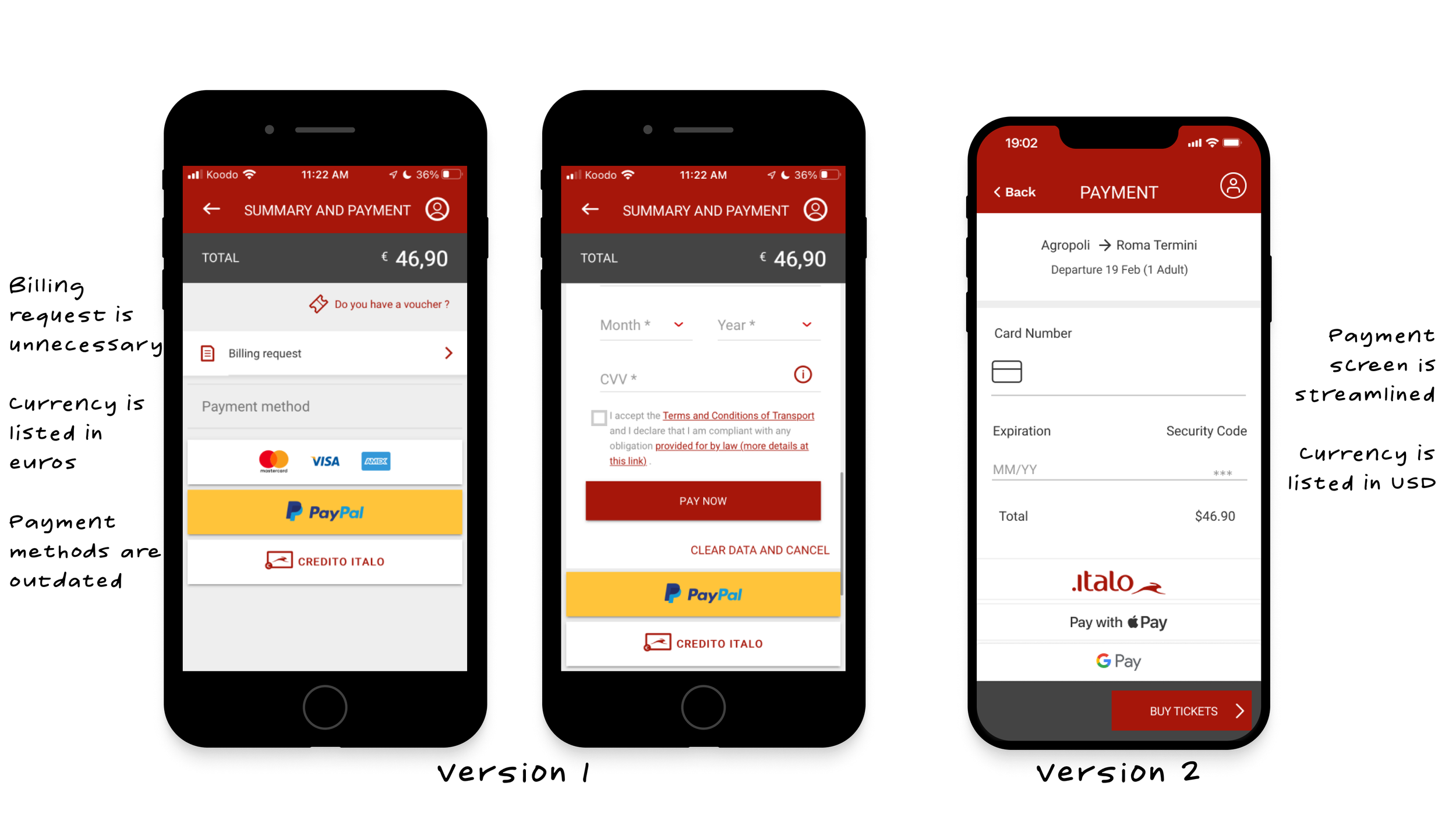
On the payment screen, we minimized and streamlined the page by removing overpowering icons, changing the currency, and outdated payment method options.
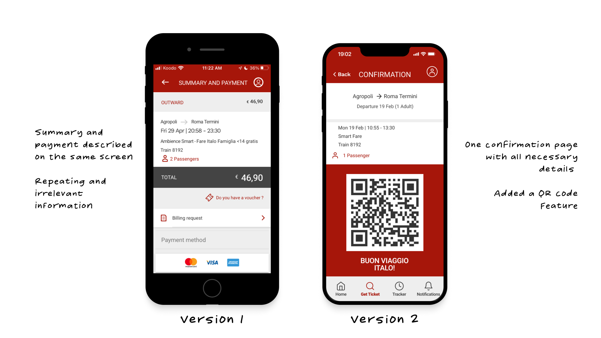
On the confirmation screen, we removed irrelevant information such as billing requests. This information should automatically be sent to the user's email. We also added a QR ticket code that will allow the user to easily get their ticket scanned when boarding the train.
key learnings & prototype
What did we learn?
Changes can be made to improve the function of a company's website or application without rebranding
It's helpful to begin by defining design constraints while designing as a team.
A UI Library is essential when working with a brand that has a defined image
Communication is the most important part of teamwork